miércoles, 17 de julio de 2024

RYO SAKAZAKI

 When Storm Collectibles took The King of Fighters license years ago the possibilitys were pretty much endless for people who have been a fan of fight games since the 90s and little by little they been fullfiling some of our collectors dreams giving us high quality action figures of characters that never before had any kind of figure or merchadise at all, despite them belonging to SNK legendary digital story.

One of those legendary moments from fight game story was Art of Fighting, a game that was way too amazing to be belived back at the begining of the 90s, with gigantic spirtes, beautifull spirte art, battle damage in real time on the characters, taunts and for the first time a "super move" that used a power bar (long time before Street Fighter did it) as well as mini games and character interactions. And there it was born Ryo Sakazaki, the main character that spark the controversy over SNK recreating Ryu from Street Fighter.

While in fact Ryo was a very different character than Ryu and theyr only similarity was the karate gi they use, this sparked a lot of rivalry between Capcom and SNK. While Art of Fighting stays there in the 90s, its character has continue to keep active even now days in The King of Fighters: Robert Garcia, Yuri Sakazaki, Takuma Sakazaki, King, Kasumi Todoh, Mr.Big and for a good reason, since this characters pretty much inaugurated the very frst The Kinf of Fighters tournament along side a pretty young Geese Howards lonf before KoF 94 (this was the storyline of Art of Fighting 2).

After this long intorudction i must say i was pretty happy when Storm show the first images fo theyr Ryo Sakazaki figure based on his KoF 98 version, giving us a chance to finally have the poster boy of every single of theyr games: Ryo from Art of Fighting, Terry from Fatal Fury, Haohmaru from Samurai Spirits and of course, Kyo Kusanagui from KoF.

In the same size as Terry and a little bit shorter than Geese, Ryo scale perfectly with all other Storm character and he stands perfectly as well since his legs articulations are pretty strong. Of course, is still a shame they dont give him a base given the character nature but at this point i think is usless to expect a base in a Storm figure.

He is articulated on the neck, whoulders, biceps, elbows, wrists, chest, waist, legs, knees, ankles and half feet and just like always, the articulations are completelly flawless and with a huge range of movement, all of them ball joints and double joints in the elbows and knees and given the simplicity of his design, nothing get in the way of the articulations, nothing at all (unlike Genjuro or Geese thick pants that keep his legs kind of stiff). 

The chest part and the top of his uniform are made with soft plastic soo nothing at all keep him away from the most dynamic poses that could make any fighter proud and the articulations are strong enough to keep them.

The sculpt is very very very good, with his manly and handsome face fetures pretty sharply sculpted, specially on the mouth, his stoic face exppression and that hair, very very spiky hair almost like a hedgehog, and specially the front part is very spectacular looking!! He looks exactly like an anime man from the 80s and i love it!!!

His design is extremelly simple, the muscles on his arms are huge but not big enough to affect his movements, with veins and a realistic texture. The black shirt under this gi is sculpted and cant be removed  but it huge his chest pretty nicelly in a very natural way. 

The gi have a pretty sharp fabric texture on it that makes it look rough and old with pretty natural wrinkles that flows with his body no matter how you puse him and the black belts on his waist is also made with soft plastic tough unlike Ryu or Heihachi or Hohmaru, the belt cant be removed soo the gi cant be removed either wich is a shame because i really wanted to see the black shirt sculpt underneat.

The pants have the same fabric texture and the feet bare feet looks natural and realistuc, even the nails are painted in a little darker tone than his skin. The whole exposed skin have a very sexy tan that Terry dosnt have and the color matches that of the hands and face.

The mouth have a pretty discret paint aplication to make it stand out but the best part are the eyes, those big and penetrating eyes with brown pupils and thick eyebrows that makes him looks too much like the character from a manga from the 80s. The blond hair have a different tone than Terry´s and have a lot of darj washes and pinks that gives a lot of volume to the already sharp spykes.

Belt, wrists bands and shirt are pitch black while the gi is plain orange with some soft yellow washes here and there to make it look used and old. The effect is pretty nice and keep it away from a very cartoony look.

This man is loaded with stuff as well, he have 7 pars of hands!!! Aside of the closed fist, he have relaxed hands, open hands, choping hands, claw hands....actually 3 pairs of claw shaped hands that at first i tough they are the same but in fact, the position of the fingers is differet....some of the fingers are more stretched than other in some pairs while other fingers are flexed...is hard to describe and the difference soo tiny it can only been seen by comparing each hand. This is testament of the amazing attention to detail from Storm Collectibles. All hands are made with softish plastic and they can be swap pretty easy.

Ryo also have two extra heads: one with a snarling expression and another one with an attack scream. Paint and sculpt matches the quality of the stoic base face expression and the paint job on the teeth of the snarking expression as well as the inside of the mouth on the screaming expression is excelent, but actually the hair in the front have also a different sculpt!!! The snarling expression show more his forehead while the screaming face have the hair moving to the side, in a motion of movement.

While the diffetent heads with unique hair sculpt are pretty amazing, by favorite part is the Zanretsuken effect part, one of my all time favorite accesorys from Storm and probablly my absolute favorite: a serires of punches up front in high velocity, pretty similar to Chun Li´s kicks. The effect consist on a wrists band with two forearms conected with a motion air effect, one above Ryo´s arms and another one under it, punching at the front.

After removing the hand and wrists band, exchange it with this speciall wrists band and add back the closed fist at the figure and you have Ryo doing the Zanretsuken, throwing a series of punches soo fast it looks like he have 3 fists. The looks is soo amazing and works soo good, this is Storm enginering and creativit at the max. The peice is made with transluscent white plastic with the first and wrist bands painted while the end section of the arms are transluscent as well as the motion effects that unite the whole piece.

It looks awesome, trully awesome and theres nothing more to say about it. My only concernt is that is made with hard plastic and put the band around Ryo´s wrists its kind of tricky and extra caution should be used while adjusting it.

Aside of having waths probablly the best effect on an Storm Collectibles figure, Ryo also have the Haoh Shoukou Ken: a HUGE blue enerfy ball that he sots from his hands like a Hadoken. This effect is really masive and took most of the box space tough the sculpt is really simple and comes in translucent and softish plastic with some hues of electric blue at the tips of the spykes. It consist in two pieces and the front piece that cover the ball have a white wash that makes it looks more dense and thick (i guess this is were the enerfy concentrate???).

The ball is hollow and the front part sometimes keep falling. I dont now why they divided into two, my only guess is that it can be stuffed with led ligths for some really amazing effects but i need to try it later. To keep the Haogh Shoukou Ken in the hair it comes with a round base with a pole at the center. The pole can be adjusted to make it higher or lower but even hollow, the ball is big and the pole tends to bend to the front soo i must be carefull with it.

And laslty theres the background, based on the Japan Tempe stage from KoF 98. This stage is really dark tough the contrast with the electric night sky and red pillars at the side gives it a rich contrast but sadly, this printed version is way too dark and the electric blue sky looks dark purple. I find it as an odd election for Ryo but given his vibrant color palette with orange and yellows, this dark brakcground makes him pop up pretty strongly soo i guess i cant complaing?

This figures show how much care and love feel Storm Collectibles for The King of Fighters; amazing articulations, great sculpt and paint, fantastic accesorys, lots of stuff to play with the character despite him being a fighter that only use his hands and nothing more and i am glad they are hadling this license, i really do and it mades me regret not getting the other characters rom the series (Kyo, Iori, Rugal, May, Blue Mary, Orochi) but i guess it may be too late by now and i am only picking my favorite characters.

Once you pass the "is a Ryu clone" thingy and know Ryo´s character as well as his evolution over 20 games, Ryo Sakazaki is one of the coolest and best men on the fighters universe and trully a legend and i always wished they make figures based on him, but for once, he was finally blessed with one that is also the very best figure they could do for him, an ultimate Ryo worth his legacy.


viernes, 14 de junio de 2024

CLIVE ROSFIELD

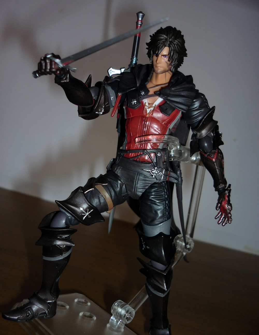
 After spending the last few years dedicated to remakes, remasters and re-release of old games, last year i find out i am still able to enjoy new AAA games thanks to Final Fantasy XVI. This game was a pretty amazing surprise for me since i wasnt expecting too much from it, but in the end, the music, the visuals, the story and gameplay, the characters, everything blow me away and it turned into one of my favorite games of all time pretty quickly and one of the most unforgettable jurney as well.

Sadly, SquareEnix dont share my feelings for the game soo it pretty much forgot about the game while it focused 100% of theyr merch machine to Fina Fantasy VII and Final Fantasy XIV. While the Play Arts Kai figures of FF XIII launched along side the game and when FF XV was out we already had all the main characters as action figures, we had to wait an entire year after the launch of FF XVI to get the very first figure of the line.

Like this wasnt bad enough, while all the main Final Fantasy games had Play Arts Kai action figures - even Dissidia - and Final Fantasy VII Rebirth already have like....3 or 4 Play Arts Kai for every single character, Final Fantasy XVI was relegated to the Bring Arts department, the low budget department of SquareEnix toy branch.

Soo this is my very first Bring Arts figure and i wasnt sure wath to expect (specially at the 130$ price point) but since this is my favorite character of the game (and my favorite protagonist of any Final Fantays game): Clive Rosfield, i was actually hyped by this.

First surprise this guy give me, its tiny...like....tiny tiny smol.....very small...at first i tough this was Figma scale but actually this is a head shorter soo he looks like a Smurf while posed with all the other Final Fantasy characters. Really he is just one Amiibo and a half tall...

And while Clive is very light and have strong legs and nothing on his design that overcomplicate his balance, he cant stand at all. This was a pretty nasty surprise for me because, usually figures this small have no reason at all to not stand on theyr own, but in the end, he cant tough they give him a base soo i guess Square kind of fixed this issue.

He is articulated on the head, chest, waist, shoulders, elbows, wrists, legs, knees, ankles and half feet, also the scabbard of his short sword have a simple rotating articulation and his cape have a ball joint. All articulations are ball joints soo they have a big range of movement. The hair clash a little bit with the back side of his cape but the limit is minimum, also the cape sections that cover his shoulders are separate pieces soo his arms can move pretty nice up and to the sides. 

The only issue here are the feet. The boots have this this floating armor like plate in front and this keep the ball joints of the ankles to move too much, also the feet dont pivot at all, soo they only can move up and down a little bit and cant be adjusted to balance Clive. I am shocked this happnes with such small and tiny ball joints.

Also i hate the elbows articulation, sure they bend perfectly but while straigth, his arms have this horrible protunding ball that is imposible to hide and brokes completelly the sculpt. Aside of this arms issues, the overall sculpt is really good. Clive´s body shape is perfect, with his thin waist and wide shoulders tough i got the feeling the hip is a little too low and that makes his torso to be a little too long.

Eevery single mottif on his arour is sculpted as well as small little cuts here and there that makes it looks battle damaged. The belts on hsi waist as well as the upper part of his cape are made with soft plastic and every stitch on it as wella s every crany on the amor on his arms are finelly sculpted.

But the best part are the gauntlets, the level of sculpt on them is really impresive, specially at this size as well as the shirt huging his torso, with all those wrinnkles and and the laces keeping his shirt in place. The cape is made with hard plastic, and thats a big surprise because Nyx Ulric´s purple cloths are made with soft plastic and that lates them flow better. Clive´s cape is just stiff...even if moved around with the ball joint it only moves to a certain limit and never lose that soft "S" shape it have tough the torn ends looks really nice.

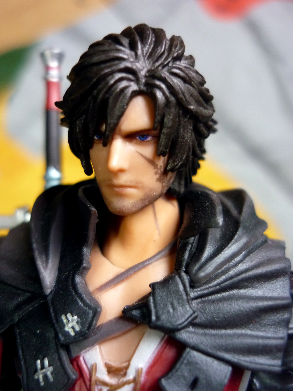
The hair have the rigth shape tough the sculpt is very fuzzy and his face have the same issue. Its easy to regonize Clive´s face shape and nose but i need to remove my glasses to see sich tiny details. Theres no skin texture here, everything is pretty clean and the lips are spoftly painted with pink and the mark cheek looks perfect but a little too grey and in low contrast.

His eyes are not sculpted but only printed but the deffinition is good and the blue of the pupils stands out, tough the beard is just a grey print on his face. His hair is not completlely black like in the game but it have a kind of metalic finish on it for some reason that gives him a kind of dark brown copper look.

His cape have the same color but without the metalic propertys and with dark washes added tough the armor on his arms and legs have the same metalic color that shines pretty nicelly and makes all the scartches and details easy to look at. Every metalic symbol on his armor is painted perfectly in silver as well as the red details on his gautlets and other belts on his legs painted in grey and different browns, the color of this figure is pretty well done for such small details.

His red shirt is the part that stands out the most as well as the red belts on the back, tough i wish the color was much more vibrant since this red have a kind of low contrast. Even soo, all the laces at the sides and the laces at the front of his shirt are perfectly painted as well wich is a good susprise. No color is invading his skin tone.

Lord Rpsfield comes with four sets of hands: closed fist, hands to hold his sword, open hands and relaxed hands. The sculpt on the little armor peices on his fingers is really amazing and they all share the same copper metalic color as well as the red palm and they are pretty easy to swap, even considering his tiny is the peg that conest them, i never had any issue with them.

Then he have his short sword that goes on his hip scabbard. The short sword is very simple and have very nice metalic finishes but he never use it on the game soo i am kind of confused why is an accesory here? He also comes with a replica grip of the same short sword soo this fit in the scabard instead od the actuall sword. Pretty weird system to keep the weapon in place....

He also have his main long sword that fits perfectly on the sheat on his back. The sword have a veautifull design with  openings between the blade and the handle as well as a pretty evident shape of a cross, with the same color palette as Clive´s clothing: silver, back and red. The sculpt is really good as well as the entire metalic painting and the overall design is really elegant and kind of futuristic. The handle can be removed soo it can be put on Clive´s hand much more easyer.

The base is made with thansparent plastic, it have an square shape and lots of holes around soo you can insert the arm on any angle you want. The arm have 3 articulations to adjust as well as a clamp in the end to hold onto Clive. The base looks way too much like a Figma base and the shape helps to not take too much shelf space The clamp´s grip is pretty strong soo it holds the figure in place really good, tough the base is ligther than Clive soo sometimes it can keep him in place.

Also...the cape...the hard plastic cape make the base pretty difficult to use but in the end, i put the clamp holding Clive´s cape instead of his waist soo that makes things much easyer. Also the base arm is strong enough to hold Clive in the air and thats very apreciated, since Figuarts base cant even do that.

And thats it.....a (very apreciated) base, a bunch of hands and a sword and thats all. Nothing more. No extra open or sifferent shaped cape, no potion or phoenix feather, no effects of fire magic, fire around his arm or any effect to cover his sword or a fireball to throw, no extra head with a fierce battle expression or a older version of the character without the mark and with the scar, no Phoenix wing or Garuda´s claw, Shiva´s cloth for his back or Titan guard arm, no Odin sword or Bahamut wings or even Ramuh´s staff....

Its extremelly easy to think on something to add here, you just need to like this character and theres the problem, SquareEnix dosnt like this character or this game at all. I know this are the low budget figures of the brand, but problem is at 130$, this is no low budget.

Both Figma and Figuarts could do this figure exactly the same but with more accesorys but half at that price. Jada too even at 1/4 the price. McFarlane Toys could do this figure as well with this same amount of accesorys as well but in a bigger scale and half the price. SquareEnix is really pulling the string too much in here....

The sculpt and paint are high quality as well as the articulations but despite this, this figure dosnt have any of the dashing gallant of Clive Rosfield and dosnt have any presence either in the shelf, since his scale is soo tiny he is going to get lost in between anything.....even Funkos. With the rigth light and distance he may looks good and just like Clive, but the more closer you look, the fuzzyer the details looks.

I dont regret getting him. I had hopes for a Play Arts Kai release but i think that wont happen, soo is this or nothing and given how much i love this character, i think this is better than gets nothing, soo i am kinda happy with this little Clive but not soo much....when you like a character this much is hard to be satisfied with something less than perfect but i got the feeling this figure dont even try to dare the tough of perfection.

They are going to release the rest of the cast but Cid looks like Ken from Toy Story 3 and Barnabas looks even more sad and fuzzy than Clive. I will get Torgal i think....one of the reasons i love Final Fantasy XVI was Torgal and he actually dosnt looks that bad like the rest fo the cast. I just....need to try to bite the bullet and convince myself its OK to spent this much money again on an even smaller figure with absolutelly no accesorys.

SquareEnix makes things soo difficult.

miércoles, 29 de mayo de 2024

ARMORED XANATOS

 Last year NECA went crazy and released the entire line of Gargoyles in a single wave. It was a VERY TOUGH year for my walltet deffinetly, but there was one single figure i skip even if that means not completing the series: Armored Xanatos. I love the look of the red Steel Clan robot, the leader of the mechanical army that turns out to be actually Xanatos. I still have him as a Kenner toy from the 90s (the red variant, not the grey basic version) but in the end, he is just a color variant of an already released figure.

This review could be extremelly short but instead of that i am going to pretend i didnt review the Steel Clan figure, soo this guy is actually quiet masive, he is a little bit taller than Goliath and that makes this the biggest figure in the series but he is also extremelly heavy, quiet an issue for him to stand still.

Despite the use of the tail, the ankles get lose over time and they bend pretty easy soo extra precautions must be used here since given how heavy he is, he can damage anything under him. 

He is articulated on the head, neck, shoulders, biceps, elbows, wrists, chest, waist, legs, knees, ankles and half foot as well as his tail, wings and the middle of the wings open up to the sides. All if this are ball joints soo in theory they have a lot of freedom of movement only limited by the design: the hair thingy clash with the wings soo he can move his head too much to the sides also the shoulder pads have a hinge too the open up to give room to his shoulders articulation.

The elbows and ankles have double articulations soo they bend pretty good and the tail is bendy with a wire. The wings shape is..... weird, really weird soo they can rotate but not open up because they end in a pretty awkard angle soo this is the only character (aside of the Steel Clan) to have articulated wings but theres not a whole option of poses for them.

The feet claws rotate soo they can be adjusted to the surface but still manouver them while avoidung th wings is really tricky. Speaking of avoiding, the whole wing as well as the claws in the hands have really ponty edges and they can cut human skin pretty easy!!! Also the phalanx on his hands are also extremelly sharp.

While Kenner gives Xanatos a pretty different armour that includes even a maks instead of a helmeth and made him looks totally different to the other robots, NECA´s version is screen accurate soo this is exactly the same sculpt as the Steel Clan robots, the only totally new section is the ted button on the center of his chest and the tubes that goes around his neck. This section is made with soft plastic and cannot be removed.

The design is extremelly cool and follows the character design of the cartoon adding a lot of extra deailing and using the Kenner wings design. The biggest point of attention here is the color, a metalic red. The red shines pretty nice and actually make the photographic job to be extremelly difficult since the red color reflects the ligth like no other color does, soo while the Steel Clan robot shines like a mirror this guy looks like a lighthouse.

Every union of the pieces and every bolt are painted in black, soo theres no lack of detail in here, but everything looks soo clean shiny, like a limousine (pretty fitting for Xanatos i guess). The abdomen, biceps and tights are painted on gunmetal black  while the slaws are white, soo the overall looks is really sext, menacing and elegant (tough i really hope the red paint stays in the bendy tail and donst start to chip away).

The accesorys are exactly the same as the Steel Clan: a pair of closed fist, a pair of holding hands, a pair of open hands and a pair of claw shaped  hands and not only they are really really good looking (specially the open hands) but they are pretty easy to swap as well.

He also have a pait of lasser guns for his amr armor. The piece on his arm can be removed and the lassers attach with a peg. They are pretty good looking and the metalic red on top matches the rest of the armor perfectly.

Then theres the fire effect of the jet blasters that keep Xanatos on the air: two small effects for the base of his feet and a big one for his back, all cast in transluscent plastic with some orange wash over them. They are really good looking tough the peg is soo small in the feet ones is kinda tricky make them stay in place.

Lastly, the only new accesory is Xanatos head with no helmeth that can replace the normal robotic head and also includes a soft plastic metalic ring that goes around his neck to hide the articulation and make the transition looks better. Sadlly, this head with a fierce expression also comes with normal Xanatos soo this is literally a duplicated accesory.

Also....i hate hiw he looks....i mean, the head is way too small for such a huge body...this dosnt looks like IronMan at all, the Steel Clan body is huge compared to a human body soo having Xanatos inside this dosnt make too much sense. In the cartoon they played with scales a lot and no one notice because, they are 2D arts, but in 3D you need to be pretty close to scale between figures and this really bring this issue.

Either you downscale the red rebot to look in scale to Xanatos (and wrong comapred to the other robots) of you sculpt a bigger head to go with this figure, but that would be extremelly akward looking compared to the rest of the line, soo NECA decided to just keep the same scale of the head and the body soo they dont match each other but each elemtn matches the rest of the line. I think this was the most wise choice but still i dont like how it looks.

Besides, this was a perfect chance to add a Xanatos head with a different face expression or blood driping from his forehead, or give him lasser effects to his lasers or some damage pieces of other robots....i dunno....pretty much every element of this figure is taken from ther figures of the line, except the red color.

This is why it take me soo long to get this Xanatos, he is extremelly cool looking and nicelly done, but in the end everything is recycled here, i mean, even Thailong - Goliath´s clon - had a different face sculpt and totally unique accesorys.

Still i am tempted to get another Steel Clan robot soo i can display this red leader one along two sentrys i dont have the space for it but now that the line is over and it will take a while for NECA to release the side characters maybe i will do it.