lunes, 31 de mayo de 2021

NIGHTMARE SPAWN

 I love Spawn. When i was a kid i remember how obssesed with Spawn i was, with its violent and dark themes combined with the bizarre art of Todd McFarlane, it was like a mix between Batman and Devilman; a demonic super hero. And despite that i dont have many Spawn figures at all, and it wasnt because i didnt liked them, quiet the opposite, McFarlane Toys released a huge array of impresive figures over the years.

It was because....i dunno really, maybe see soo many made me not give them importance since i ended focused on other collections. But the one i got pretty fast in the moment of release was Nightmare Spawn, no doubt i needed him since he was such an amacing piece to look at.

I think he was also on the last wave of Spawn figures before McFarlane Toys went to the toilet soo it was one of the very last masterpieces from that company as well. Despite it size, he came on a clamshell like all other action figures back then and he is on scale with modern NECA figures: a little bit taller than an average human but smaller than a Xenomorph.

He cant stand on his own of course, and he is not sopposed too since he is levitating based on a cover from one of Spawn comics. His base is one of the coolest things of the figure since its a small black bricks floor with a circle of fire around while Nightmare Spawn is on top of it. The bricks are really nicelly textured and painted despite being totally hidden and the flames are made with soft transluscent plastic tough they still have some red tones here and there.

Also, McFarlane think on long term here since the figure is balanced by a thick metalic rod, not a plastic rod that could be broke or bend by time soo the figures has been levitating for more than 10 years with no problem at all and keep his balance perfectly. The long rod run on the figures back and inter into a hole on his back in between his wings.

Now the creature, its a magnifiscent creature really, with a wood texture on his skin and those animal like legs with inhuman and almost skeletall feet, the sculpt is trully impresive, specially on his hands. His hands have this HUGE pointy fingers looking like spider fingers and the arm armour is also filled with sikes, very pointy spikes.

His head with no limps of nose looks like a skeleton with horns and his wings have an impresive wing span. Tough his wings are not simetrical since one of them is more extended than the other, maybe this was a quality issue since he has been like this always.

Paint is equaly impresive, a dark grey for his body and red for his arm armour, some browns for the marks on his face and teeth and radioactive green for his eyes. His skin looks like made of coal or woord thanks to the color and texture and theres a lot of dark tones around his arm armour. This kind of make the red darker than it should tough....but i do love the green on his eyes. No matter from wath point you see this figure, his eyes shine under any kind of light.

His rob is completelly made with soft plastic and is ful of dark hues to make it looks old and used, full or shadows. This mean the rob can be moved around to bette rlook his back, not very usefull, but it helps to make the figures leas cheap and also the material is lighter.

The wings have a yellowish tone, with lots of dark sections to give them a dramatic sence of shadows and dark veins covering them, with not issue on the sculpt of paint application expect the asimetrical nature.

There is no accesoryes and there is articulation: cut articulations on his biceps and one on his abs. Totally useless articulations since the arms dosnt move too much by the sides and the cut joint looks really bad and there is no reason to move his lower half at all. Its like McFarlane just added this articulations to give this guy a "action figure" classification since he is on fact a statue.

McFarlane used to be an expert on horror figures and the very first to produce them as well, there is something on his culpt and paint that looks raw, something on the poses that make the characters scary and creppy, a kind of dramatic effect and this figure is the best example of that dark magic they used to have.

lunes, 24 de mayo de 2021

UBIK & VOID

 This month Kentaro Miura passed away, one of the artists i most admire and whos work has been extremelly relevant and important for for 23 years probablly. He leave taking with him the voices of the world he created but he also leave behind much more; a piece of art that meant his entire life and was born on him since his childhood.

Oviosully, Berserk has been my favorite serires to collect aside of Devilman, Metal Gear and Resident Evil and i can say the most expensive pieces i have on my collection belong to Berserk and one of those pieces is this one; the most crazy expensive Figma i ever got and i am sure i will never buy one of this again: the double feature pack of Figma Void and FigFIX Ubik.

Ubik is tiny, deffinetly the smallest Figma (eerrr....FigFIX?) i ever seen since he is the same height as Conrad but his body is much more compact. The sculpt is beautifull and sharp, with ever crevice and...."structure" perfectly deffined in this small scale. Tough his body is pretty difficult to descrive, looks like an insect or some kind of crab with fins of a fish.

Hes body is really shiny and black but not the same black as the other God Hand members: while Femto´s body is dark purple, Slan´s wings are dark violet and Conrad´s shell is just black, this guy have pretty soft grey and blue tones. Its imposible to notice it until you see around him the rest of his comrades, but his body is a different kind of black, wich speaks very nicelly of Good Smile Company attention to detail. 

Tough the most colorfull parts are his hands and face, both painted in a cadaveric blue/grey. His head is actually quiet big, specially compared to the human characters, Ubik head is 2 or 3 times bigger than an average human head. Both the sculpt and paint are pretty nice, specially on his twisted and repulsive face expression. One thing that pick my attention is how his teeth are not sculpted but only painted, i wonder why.

He cant stand at all of course but have a hole on his tomach and a traditional and awesome Figma base with an articulated arm soo he can hover to different heigth and keep his balance pretty good. Impresive.

As a FigFIX he is not articulated at all, is just a small statue tough he comes with a second pair of open arms. The arm change from the shoulder works pretty good and is really easy to do and helps him to have a little bit of display options.

The second figure of the pack is the main dish and the reason why this damn thing came in such a HUGE box; the God Hand leader Void. While Ubik is the smallest character, Void is by far the tallest Figma to be released since he is haf a body bigger than the rest. He can stand on his own perfectly oo no base needed and have only a single articulation on his neck that gives to his head pretty good movility.

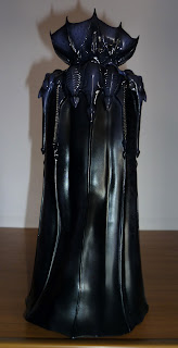
The sculpt is very exquisite, specially on his shoulders. The Giger-esque design os magnifiscent from the "fingers" that comes our from his neck to the neck piece that crown him, looks very organic like a bat and yet it looks like a mechanical exoeskeleton, like a Xenomorph and just like the rest of the God Hand member, he is not just black but a mix of purple and blue and with the ligth you can see some feckles as well, almost like in the wings of an insect. Is pretty amazing how simple looks this characters and yet how much is going on in them.

There is some golden details on the "fingers" of his cape (since its not a cape but wings) but most of the color is of course on his head. The sculpt with the big brain and skeleton like epxression is as good as the paint, brown with orange on his brain and pink on his gums with some dark wash here and there to highlight details and made him look like a pencil drawing. 

Tough i have to say, he is missing the hooks that pulls his lips and the sew on his eyes, maybe they could not pull that off because of the small scale? Or maybe it was way too gruesome for Good Smile Company? I mean, they cesnored Slan as well....mmmmm.

Despite this very difficult to notice omision on the design, he is pretty amazing looking, elegant and menacing like a tower and incredibbly detailed. Even his not completelly static since his wings are not like a cilinder, the front side of his cape is moving forward and the back side have some wrinkles, he is not standing, he is actually moving forward and hiw cape/wings amove with that motion.

Also he is completelly hollow, like a ghost, wich suits him pretty well but the reason is his accesorys, and this is were things got pretty wild and serious: he have an entire extra body fully articulated because, well, hes a Figma, not a FigFIX like Ubik.

First remove the central piece with the two circular structures that are on his chest as well as the shoulder pad pieces and the stricture on the back and his entire head and shoulders can be removed from his body. Wath lies under his head is...well....nothing, just a pair of giant glands like testicles and a bony structure similar to a hip along side 4 different ball joint articulations on each side.

Next step: add his extra wings. Two extra wings witha rounded shape should be placed on the bony structure under his body with pegs, then two HUGE wings are added at every side of his shoudlers using the free ball joints. This hige side wings cover his entire back as well as his sides and have an articulation on the middle.

Next step: add the big wings that represents his back and centrail structure, one of them with the big circular chest piece. All this six wing thingys have the exact same color and look than the "stading" body tough they are made with soft plastic and an structure of wire under it, soo they are totally bendy and can be moved and posed wround like if the wings are moving by the wind.

Next step: the base. Void have a HUGE circular base with a mountain of red faces from the cilpse on it as well as a bony column. Insert the column on the base and Void on top of the column with  ahuge hole under his tiny body, and thats it, he stays hovering, levitating on top of the face mountain. The column is pretty gruesome and ncielly painted and sculpted and the base have a good sculpt tough the paint is a little simple, just red with some black washes.

Thanks to the base and the column, Void grows on size dramatically and he towers over all other Figmas in an imposing way (over over his God Hand minions). The base is sturdy as well as the column that holds him.

Speaking of accesoryes, is not over yet: he comes with a pair of long, loong, loooong and thin arms that can be conected with pegs over the testicles like organs under his neck. His hands are enormous, and heach hand have six fingers, six fingers that looks more like spider legs thanks to theyr spiky nature. They have a soft brown color and have really good articulation that gives them a huge range of motion on the wrist, elbows and shoulders (?).

The big wings are extremelly heavy and the arms are too thin and weak to soport them, soo they also included a couple of articulated transluscent arms that cna be conected to the face hill base. This arms have a rign that fits around Void wrists like handcuffs and can be adjusted with the two articulatiosn they have soo Void hands can be upward and resist the weigth of the wings/cape. Good Smile Company did an spectacular job in here.

There is no over, since Void have also 3 extra pair of hands: one closed fist, one flexed like if calling someone and a final set with a finger pointing (at his victims thats it), all hands can be removed pretty easy and adds a lot of persinality with this character that have mostly one face expression.

Finally, he have the mark of the sacrifice, a transluscent plastic  sacrifice brand that can be put on the pal of his hand (any of his open hand) with a peg and a hole, to recreate the moment he brand the Band of the Hawks.

This is the biggest Figma to date, not only on size but also in accesoryes department since hes loaded with a toally independent body, is like two figures in one. I have yet to know if there is a Figma as stuning as this one tugh he is certainlly not perfect at all.

Aside of the missing hooks and sew on his face, build his articulated body is hellish.....pretty complicated specially considering the weird chape of his head and shoulders, is very hard to hold him and conect the pegs strong enough and not broke him, he is really delicate. Also the wing pieces that form his body are too heavy and tends to fall apart pretty easy. I am afraid i end broking some of the pegs that conect everything and i can just hope Good Smile Company materials are good enough to resist.

This is one hell of an ambitious figure....is beautifull to look at but really stressing to move around; a puzzle of moving places and pieces that levitates thanks to small pegs and ball joints. I wonder if it would have been better to make his body of fabric with wire underneat....tough that would have add extra layers of complexity as well: wath fabric can match the texture and color of plastic?

The "wath if" does not exist and this figure is wath it is: a delicate puzzle, a pretty fun and awe inspiring puzzle. Miura was a genious character designer for sure sinc ehe created such imposible creatures in a pretty deffined and solid build. Now i wonder: is this the official body of Void? He is actually a head with a weird nervoius system underneat and long arms and nothing more? Or Miura had something else in mind to wath lies under Void wings? Now that he dies we will never know.

This figure was pretty expensive for me, i didnt expect spent this much money on something like this tough it is a pretty nice figure, a pretty amazing design actually and once he is together with the rest of the God Hand, i can say i have no regrets getting him at all.

viernes, 7 de mayo de 2021

DIRE


Its been a long looong LOOOONG time since i last bougth a McFarlane Toys figure....2005 probablly. Theyr toys from the begining of the century as well as the 90s are still amazing jewells to this day but most of wath they been doing this century has been trash literally tough McFarlane has been advancing little by little to achive the quality it had 20 years ago.

And Fornite...as simplistic as that game is, it deffinetly have some amazing character design and models, building good looking characters that sometimes looks better to theyr original design (Ryu) and from all theyr first design, i think the best one is the sexy werewolf skin Dire soo i ended getting him.

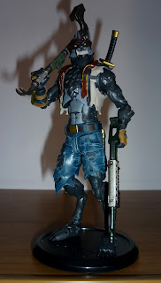
This guy is standar action figure size soo it matches with most lines (there was a point when McFarlane figures dwarfed for no reason...) and he can stand on hiw own perfectly, something outstanding considering the odd shape of his legs. But still they give him a black round base with the logo of the game. The base works perfect with the pegs and helps Dire balance even more but.....i cant stop thinking on the glorious diorama like base McFarlane used to do on the 90s.

This guy is the most articulated McFarlane figure i have to date wich kind of conflicts with my idea of the company. He is articulated on the neck, chest, shoulders, biceps, elbows, wrists, legs, knes and ankles and uses ball joints mostly wich offer a big range of movement. Some of this articulations are kind of restricted tough, specially on his arms. I dont know why but his shoulders seems pretty stiff, but most of them works perfect and gives him a big range of movement, specially on the leegs.

The sculpt is pretty good, specially on his face. I love those huge fangs and menacing eyes and how he is not a cute and soft looking wolf, quiet the oposite, and McFarlane catched the style of the design perfectly, even with the fur and the pants. There is not texture here, just the shape of the fur and clothes full of angles that flows perfectly with its body shape and articulations.

There is just one single part i dont like in here and thats the hands....in the game, Dire hands have long finger with claws but this figure have tiny hands with short sausage fingers and there is no extra hands, just the basic "holding item" shapped hands and they dosnt work at all!!! He cant hold his accesoryes at all...the hard plastic of the hands dont let him open his fingers enough to hold them soo the hands are not only bad looking, but they dosnt work either!!

Paint is good too. There is some hue and shadows on his shorts to gives them a jean look, but the rest of the figure have solid colors with no softening or shadows or shides to accentuant anything, just solid black with solid grey on his abs and solid white on his teeth but since Fornite is mostly cartoony, matches the character pretty nicelly.

Aside of the base he have 3 accesoryes: a katana, a shotgun and a hammer. The katana can be put on his back with a peg and a holeand thats it...it can be removed from its sheat soo it only works as something attached to his back. This is odd but in the game, most items work like this...just cosmetic items attached to the characters back.

The shotgun is nicellt sculpted and comes in a plain gunmetal black and the hammer is pretty funny looking and extremelly warped, tough this works in favor of its design and is deffinetly my favorite accesory of his, despite he cant hold it with two hands.

Overall, this is a fun figure to play with and have a nice aesthetic as well despite having some issues like his weird shaped bandana and those ugly and no working hands. But....he was actually quiet cheap, soo i dont know if its fair to judge him too harsh. Is weird to see McFarlane moving from high end collector delux items to mainstream kids toys but if they make a figure of Menace or some other good looking Fornite chraracters i would be getting them.

miércoles, 5 de mayo de 2021

VALAK

 I have lots of issues with modern horror movies, they range from being too goofy to being way too boring (The Witch), very few are worthy of amy interest and one of them is the Conjuring, wich i find way too chessy and inocent. The only Conjuring movie i kinda liked was the second one, mostly for its great monster design in Valak and Crooked Man.

The "Nun" or Valak; the Marquis of Snakes turned out to be a really good monster design simple enough to not be ridiculous and revolting enough to not be boring, mixing the demonic and sacred elements of a demon disguised as a nun in a brillant way. Too bad the character was wasted in a pretty basic and generic movie of his own.

I was susprised when i found a statue based on the character, from Diamond Select; a brand of very questionable quality...but i ended getting it anyway because of the impact this statue had even inside its box. It was expensive!! But it was worth it for sure. He is REALLY BIG...like a Hot Toys figure, this creature is one of the tallest figures i own.

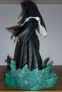
He can stand perfectly, and have no articulations or accesoryes, its an sculpture on all sence of the word. Valac is standing, on a pretty static pose and pointing out with his hand at the front with a menacing face expression. There is nothing more to ask for a character like this, a serious and powerfull pose to give him an aura of danger.

Valac is not static tough thanks to his nun outfit and coif that is sculpted moving around as well as the belt and the long sleves. The other element that gives it movement is the base; a whirlwind of green fire around the creature feet. This fire is not only green to stand out against the black and white character, but is made with transluscent plastic wich makes it shine and is really helpfull to add it a led to give even more impact to the display.

The sculpt is really good but simple, most of the sculpting comes in the rugged texture of the outfit as well as the wrinkles that flow with the subtle movement. The hands are nicelly sculpted in a claw like pose but most of the sculpt is on the face, wich is really fantastic and have all the bizarre face features this character portrai: the long nose, sunken eyes, big jaw and pointy teeth on an almost serious expression since it looks like is about to scream or growl.

I have my doubts about the face expression tough....is not bad, but a screaming face with all the piranha teeths out would have been much more impresive but maybe too unnerving? I am not sure...i wish they added an extra head for display options.

The color is pretty simplistic: non on the base and the entire body is just jet black and pure white. No shadows or shade of any kind, just black and white like a domino piece. The hands and face are different tough, since they come in a grey tone with green almost rotten fingernail and lots of blue veins. The face have black lips with black eye bags aside of the soft and tiny veins covering the skin.

The little yellow rings stand out nicelly from the darkness in the eyes. The figure not only looks really creppy and menacing on any display, but is pretty easy to handle and is very sturdy. I just wish they added an extra face screaming, but aside of that i am impressed by Diamond quality in here.

lunes, 3 de mayo de 2021

NOSFERATU


Thanks to McFarlane Toys, at the begining of this century lots of action figure companys were born, picking up exciting licenses for the newlly formed adult collector sector, like movies, videogames, books or just original characters and one of those newborn companys was Aztec Toys who chose to laucnh themselves with Silent Screamers, a serires of action figures based on silent movies monsters, creatures from the 1900-1930 cinema.

Now day launching a serires based on such niche characters would be unthinkable....everything thats not DC or Avengers is a high risk scenario, but back collectors were hungry for this kind of obscure characters and it worked. The first line consisted on four figures: Cesare and Dr Caligari from The Cabinete of Dr Caligari and Knok Renfield and Nosferatu from Nosferatu.

While i found Knok and rhe Dr Caligari kind of boring, Cesare was a really fascinating figure...but i ended getting of course, Nosferatu since he is a must from any horror fan and a monster by one of the most horrifiying movies even after 100 years. He is taller than your average action figure and cant stand on his own at all thanks to the weird shape of his legs and is totally dependant of his base.

He is articulated on the neck, shoulders, elbows and wrists and thats it, wich makes him a pretty static figure, almost like a statue, wich was the tradition back then. Articlations are limited since they are cut joints and only the shoulders have ball joints soo he can only move his elbows on one direction but thanks to the sculpt of his hands, he can achive a few different poses with certain movement.

He is not accurate, non of the figures are since the sculptor decided to go in a more cartoony way, exagerate the features of the characters to make them look as grotesc as he can and he trully achive it with Nosferatu. His entire body is twisted and contorted in a bizarre way, this vampire is advancing in a zombie like movement, you can see his hips bones protunding from his clothes, he is almost an skeleton.

His hands are huge out of proportion, with big beins covering them and long figer nails and his face is as bony as the rest of his body: with his huge vampire ears down, big insect like eyes and rat fangs in front, he dosnt looks human but more like a dead ghoul. The sculpt of the wrinkles and veins on his skin as well as the texture on his jacket are really amazing.

All this details looks more sharp thanks to a very precise painting as well. Blue ants and grey/black jacket all with different shades of grey to give it a....weird look...he kinda looks like an oil paint on canvas. His skin sectios are cast into a grey and sick looking color plastic with his red mouth and yrellow fingernails as the only brigth color elements.

Also this plastic is kinda transluscent because it have a weird iridisency, like a pearl, wich makes him more ghostly. Also his skin had an action feature: put him under the sun light and his skin will change color into purple. Sadlly, my figure skin change dosnt work anymore.

His only accesory is a big base with a floor full of rats and a crumbling wall. This base can be attached to Knok Renfield base to form a kind of diorama where Nosferatu is out of Renfield cell chamber in the asylum. The base is kinda thick and strong and the rats are all made with soft plastic wich kinda makes them odd to the touch.
I love how the rats have different colors tough and little red eyes, they add a lot of movement to an otherwise static base. 

Over time, Aztec Toys continue making more Silent Screamers and change its name to Mezco, producing the Living Dead Dolls, Universal Monsters and ONE:12 Collective line wich includes lots of DC and Marvel stuff soo they manage to have great succes in 20 years. Last year they even remake this Nosferatu figure as a ONO:12 style figure but it was soo unbelivable expensive i wasnt able to get it.