lunes, 23 de agosto de 2021

FRANKENSTEIN

 I was really dissapointed when Mezco included the Frankenstein Monster in they brand new ONE:12 Collective serires and cancelled the rest of the Monsters because of a "lack of interest from public", specially considering the last time the Monsters had an action figure serires was with the really mediocre and odd Diamond Select. It looked like the only good figure representation of the Universal Monsters was going to be the Sideshow figures.

But now, 20 years later, that changes thanks to NECA and theyr Reel Toys serires of figures based on movies, specifically the Universal Monsters in theyr 90th anniversary, with a celebration with Ultimate action figures and the very first release is again, the Frankenstein Monster.

There´s two version of this figure, one full color and the other one in Silver Screen Edition (black and white). For some strange reason the color version is much more rare to find and exclusive to WallMart (in the USA) soo this guy was a challengue to get and was quiet expensive but it was worth it.

The Monster is in standar action figure scale, a little bit bigger than your average human figures (like a Predator) and can stand on his own perfectly with those huge and heavy shoes. He is articulated on the head, neck, wrists, shoulders, elbows, wrist, legs, knes and ankles and every single articulation works marvellous. Is ironic how such stiff character have such movility in here but is true, all ball joints works perfect and not a single thing prevent or block his movement since his jacket is made with sift plastic.

The sculot is terrific, the wrinkles on his clothes hidding the articulations, the rugged texture on his jacket and pants and specually the portrait, there is an awfull lot of Boris Karloff in here, the little wrinkles around his lips, the sleepy look on his eyes, the bags under his eyes, his jaw line, this is one of the closest sculpt i ever seen of Karloff if not the best one, specially considering the scale.

The paint is amazing as well. He is fully dressed in black and of course each piece is cast on said color, but it also have some soft wash of greys to give it volume to the texture, some soft browns on the pants and boots that looks like dirt, looks pretty somber and dark considering all other toy companys always dress him in green.

But the most impresive part is the flesh. Again, instead of painting him neon green or lime green, like he is on the posters, NECA chose the color Jack Pierce (Universal make up artists) mentioned on an interview, aparently Pierce painted Karloff with "Palo Mortis".... the color of a few days coprse, a kind of grey/green tone with soft purple bruises.

And that odd color looks fantastic since the Monster really look like a decaying corpse, with his black fingernails and lips and the purple eye bags, along the skin texture, the result is something frightining realistic. Also, the fresh and weet blood on his scars and around the bolts on his neck gelps a lot to make this figure trully photorealistic.

As extras he comes with a pair of heads and two extra pair of hands. The hands with different gestures looks perfect and can be excahnged pretty easy as well as the heads. Now theres one head snarling and another roaring. The snarling one i tough looked like a silly smile at first, but in fact is a face expression Karloff used when attacking Elizabeth on the movie.

The roaring expression is of course, for when the monster gets violent and both heads have a terrific sculpt. the wrinkles on one half of his face, the small pointy teeth, each sculpted independently and painted perfectly, the tongue inside the mouth, NECA trully reached perfection with this figure with both sculpt and paint (and playability too).

His other accesorys are a pait of handcuffs with a real metalic chaing. The handcuffs cannot be open but instead can be inserted on his wrists by removing the hands. And also a set of flowers to represent the Monster´s innocense, when he kills little Maria by accident. This flowers are pretty basic looking and are the most colorfull item on the set, but fits perfectly between his fingers.

And thats it, theres not a whole lot of acccesorys in here for an Ultimate action figure, but them again, is not like the Monster interact with a lot of items in the movie either soo i dont blame NECA for this, specially considering how brillant is the rest of this figure: fantastic sculpt, amazing painr, great working articulations, he was expensive but i dont feel bad for paying for it.

And considering the box comes with the art of the original poster used to advertise the movie, i am tempted to say this figure....is actually....superior for that of Sideshow....maybe this is the best Frankenstein Monster we ever get soo fat in 90 years. With the rigth light, is pretty easy to mistake this figure for a living, breathing Karloff and thats not an easy task for a character like this.


lunes, 16 de agosto de 2021

GUTS

 Its amazing how time flys since it was eight years ago when Good Smile Company launched theyr Berserk movie serires figures from theyr Figma line, i remember it clearlly because i saw Guts Band of the Hawks and i had no money ....and never saw him ever again since a year later he was twice the price and by now they ask an absurd amount of money for him.

Tough Good Smile Company was nice enough to relaunch many of the Berserk figures and i finally was able to get the Guts Band of the Hawk tough they say this is a repaint version, i really dont see any difference with the original edition aside of the box design. This was a pretty desired figure for me since is pretty much the only Berserk Figma i was missing after completing the God Hand.

Guts is a little bit taller than Griffith and Casca soo theres no issue with the scale at all and he can stand on his own....sorta...sometimes, more about that issue later tough he comes with the traditional and always trusthfull Figma base with an arm on his back. He is articulated on the head, neck, shoulders, elbows, wrists, waist, legs, knes and ankles. 

Artculations works really good since the armour on his shoulders is made with soft plastic as well as the armour on his hips, he can move with total freedom except on the ankles. Somehow his boots dosnt have too much room of movement and that makes him stand kinda tricky.

Sculpt is really good, only his mouth and nose are sculpted and his eyes and scare are only painted, wich gives him a pretty "anime"look and that makes sense since this is based on the movies.The armor is very simplistic, much more than Griffith´s and Caska´s but the very few details it have are pretty good looking, like the engraving on the sides of his chest or the knife at the front.

Every section is cast on the dominant color soo that gives him a pretty clean looks with only minimal sections painted (like the buckles or bandages) but this small bits are perfectly painted (i specially love the look of the bandages on his hand and metalic texture on his armour).

And the cape...oh the cape!! Unlike Griffith´s or the Black Swordamn´s capes, this one is made with solid plastic. The sculpt is good, with folds and everything that gives it a really heroic sense of movement and matchs the figure nicelly, dosnt looks as cheap as the other paper/fabric capes Figma did but this cape is actually quiet heavy....and that prevents him to stand properlly without the base. And even with the base, it needs an extention in order for the arm to moves around the cape and reach his back and thats quiet awkard.

Also i was expecting the cape to be articulated but is not. It fits with a couple of posts on Guts back but is rock solid soo you can move it around for more dynamic poses, soo in the end is the cape wath prevents some of his movements. The top section of the cape is a separate piece that fits around his shoulders and while it fits nicelly, in certain angles is ptetty obvious there is a big gap between this top piece and the rest of the cape.

Because, of course, the sword. His main weapon is a long sword that fits perfectly on the sheat on his back and inside the gap of the cape. The sword fits perfecty and easy on the sheat and is really good looking, specially on the handle with bandges, looks pretty savage and rough and the small piece on the end can be removed soo the sword can be inrested on the hands.

The other accesory is his helmeth, again, much more rough and savage looking than the heleths of Griffth and Casca, the sculpt with all the bolths and identations is perfect. The front side can be detahced and once you remove Guts hair piece, the helmeth fits on his head perfectly.

There is also an extra face plate with a fierce screaming expression. The paint work on the mouth and eyes is really amazing tough the face shape is kinda odd...i like the neutral face expression more. And the other accesorys are a bunch of extra hands to hold his sword and open hands, all can be exchanged with no problem at all.

I hated the Black Swordman Guts cape as well as Griffith´s, they looks soo cheap and separate to the sculpt. Now this Guts have a plastic cape and while is really good looking, i am not sure wath to think about how limits his movements and standing abilitys.

Despite of that i really like this figure a lot. Guts here looks really cute and almost innocent, very youthfull, maybe for the soft smile. Is imposible to make a more perfect figure at this small scale, and yet this will be my last Figma. This guy cost me twice the price of Griffth or any other human Figma, it was really expensive.... i think this brand already reach the point of no return on the prices, just like Play Arts Kai did years ago, the quality is top notch and i love the articulations, but they are soo tiny to be this expensive....


viernes, 13 de agosto de 2021

PHANTOM OF THE OPERA


Years before McFarlane redesigned the classic Universal Monsters it released a series of playsets based on the creatures, with a couple of ariculated figures, accesorys and a background diorama in a tiny scale, this first step into the McFarlane Monsters was relaly memorable and a lot of fun for us kids from the 90s and put the brand name in our radar.

After some beautifull displays like the Sea Creature, Dracula and the Werewolf, and other not as spectacular, like the Mummy, they close the line with the Phantom of the Opera, a character that many forget is one of the main Monsters (McFarlane himself forget him at all on later lines) and just like the Sea Creature, they chose to go with a vertical aproach.

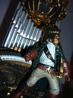
The main monster is similar looking to dracula tough his suit have stiches all over and have a giant Jack Skellington vampire tie on front. Like Dracula, his cape is made with real clothe in propule but his face is much more hiddeous. I dont know if he looks like a mummy or a victim of a masive burn, but he is bald and his skin is grey, and totally distorted.

He can stand perfectly and is articulated on the neck and shoulders and comes with a sword that fits on a sheat on hsi waist and a mask that cover the entire top half of his head more like a bandana. The mask have golden and pruple paint on it and while it fits perfectly on the Phantim´s head, is not as detailed as his actual face. I mean, this is a tiny figure yet i can see his eyes and teeth perfectly painted.

His play companion is the Vicomte Raoul de Chagny, havig the same scale as the creature and the same articulations, his outfit is much more elaborated (looks like a pirate for me) but have the same odd anatomy of the humans in this line: chuby limbs and a short torso and big head. Also paint is not as perfect as with the Phantom since the brown of his hair and mustache invades his skin and viceversa.

He comes with a heavyer sword that can got on his hand perfectly or in the sheat on his waist and a mask, since the action take places durong the Bal Masque de la Opera. Raoul mask is pretty odd tugh since looks like a golden goat with jade green eyes and it makes him looks very demonic, much more than the actual Phantom.

There is not a whole lot of room to play with in here tough despite this is the tallest playset from the serires, there is the Phantom layer at the bottom with his pipe organ, and a balcony in top as well as a wood beam on top to balance the gold chandelier at the center. Despite that the result is extremelly good looking and very dramatic, this is actually the most theathrical of all the playsets.

The pipe organ is really fantastic looking, full or ornaments and cravings on the bottom and dozens of silver pipes, its loosk a lot like an evil villian hideout and the balcony is as heavy intrincate as the bottom part with elegand golden design, rock columns and a golden arch on top that reads "OPERA HOUSE" as well as red velveth curtains made with actual clothe.

The beam is not too playn either since it have some golden details as well as a rope around. The chandelier have real chain tough the candles looks kinda silly since they are just white plastic pieces. Push the chandelier top a little bit and it falls as a deadly trap over any of the characters on the bottom. But you can also put the Phantom on the chandelier to escape or have a sword duel on the air with Raoul, soo there is a lot to do in this tiny space.

Overall, i think this was one of the most spectacular looking playsets on the line, with a great use of space, loads of fancy details and unique features and was a pefect end for such a fun serires. Now day McFarlane Toys are making playsets that looks like boring maquetes from Lego soo in the end i apreciated this sets much more.

jueves, 12 de agosto de 2021

SEA CREATURE

 "When you think McFarlane, thinks Monsters" says the insert on the McFarlane Monsters action figures in 2002 and the responsible for that is actually the playset line of McFarlane Monsters from the late 90s. It was such a unique and spectacular idea, specially with the father of Spawn twisting the characters at his own style. It had some boring results (like the Mummy and the two Frankenstein) but most of the time his playset were stellar.

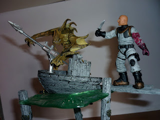
And one of the best was serires 2 Sea Creature, the reimagining of the Creature From the Black Lagoon. The titular creature is one of the biggest figures, like the Werewolf, he is hunched but still heavyer and bigger than Dracula or the Mummy (tough he is still the size of a Funko Pop). The big fins at the sides of the legs and arms as well as the back and the long limbs make it less human and more fish than the traditional Gillman. Also with the face and yellow tone he almost looks like a dragon.

The sculpt is really fantastic since it not only show all the muscles of the creature but the scales with a different variety of size and shape in the rigth part of the body. For a fantastic creature, its pretty accurate to reality and the paint helps him looks pretty natural and distant from the Universal original design. He can stand on his own and is artiulated on the head, legs and ball joints on the shoulders and chest wich gives him a pretty high range of movement.

His companion is a nameless human on a 19th century diving suit. His anatomy si as childish as Richard from the Wolfman - with a short torso and chuby legs and arms - typical from kids toys back then. His suit is grey with some black sections and his face is as generic as it can be: a bald man with a red mustache.

He comes with a small nife to fight the huge monster and a result, he also comes with an extra damaged arm with a bite on it. Change the arms is really easy and the blood and damaged muscle looks really good tough the arm can also bi displayed as another victims remains on the Creature claws, maybe the friend of the diver? He also comes with a big golden old looking helmeth that fover his head perfectly. I admit i prefer to display him with the helmeth on since theres nothing likeable into this tiny man.

The playset consist on the lagoon´s bottom, a piece of sand with bones, wood and even golden coins. The sculpt and paint are kinda on the childish side but is a good base. Next there is 3 thick posts that made me think this place is close to a harbor, and this are used as columns to sopport the water.

The water is a piece of green transluscent plastic with bubbles to indicate the presence of something under it. Its pretty cleaver since this water effect looks fantastic from the bottom of the playset and the top and would be even better with a light in the rigth spot. 

There is also an ancient looking boat (is evident this set time period is not modern) that is cut in half, with some wood drevins floating around to stand the characters on them, the boat also have a rotating wheel as well as an harpon gun. The gun is articulated and can be moved to any side and upand down and includes a shooting spear. Since there was a lot of complaigns about kids eyes duffering with the missils of theyr toys weapons, the spear is made in very softish plastic (that could still damage any eye anyway).

The paint of the boat and the wood columns is really good, to the point that the bottom half that is under water is painted in a darker grey tone. The details on this set are really fantastic and a huge inprovement over the Mummy. It also have a better visual language since is pretty obvious the Sea Creature and the diver are not friends but still they complement each other nicelly and can take his battle under water or in top, on the boat.

Despite some childish details, like soft material or the lack of deep details on the bottoms lake, this is one of the gems from the begining of McFarlane and why of the reasons why the brand reached such legendary place on the industry.

miércoles, 11 de agosto de 2021

MUMMY


In the late 90s it was very nice to be a toy collector, not only everything was much more cheapter than now but the industry was also leaping and growing to a more adult market and on America it was McFarlane part of that change since it was the very first company to be associated with horror toys for both his Movie Maniacs and McFarlane Monsters lines.

The Monsters consisted on small scale action figures with a complete playset with accesoys and extra figures; a cementery for Dracula, a lab for Frankenstein, a forest for the Wolfman and a church for Quasimodo soo a year later, they released a second serires with other 3 monsters to play with. To my dissapoint and confusion, the first set was Frankenstein....again....with a two headed creature. I never understood why McFarlane had such a big dislike for the Bride of Frankenstein, he avoided her like a plague.


The second set was much more interesting tough; the Mummy. Bust again, this is the playset i like last tugh that not the problem of the titular character. The central piece is actually the best part of the set, the Mummy have such a good looking design: she is dry, grey, with hism limbs twisted under the rags of bandages and his head is almost pure bone, with his jaw completelly disjointed.

He is articulated on the head, shoulders, a elbow and legs, all basi cut joints soo theres not a lot of posability in here but all the bandages are made with soft plastic, soo the very little movement he have is not restricted. The sculpt is really outstannd as well as the paint, specially on his eye and teeth since this figure is on a really tiny scale after all.


His companion is not as stellar tough....is a statue of Anubis and comes armed with a big ceremonial lance. Is articulated on the head, shoulders and waist and cant stand on his own even removing the giant lance. The sculpt is really simple, with some cracking and stony details here and there but he is kinda plain....and the paint is also really plain. Mostly yellow with only a few blue details on his head dress, he pretty much blends with the background.

Also while the character is a little boring looking, its presence is also really confusing. Is he alive? Is he a guardian of the tomb? Does he help the Mummy or he actually fight against him? While in Dracula it was obvious the vampre bat was a transformation and Richard was a victim of the Werewolf, here this Anubis creature role is completelly obscure.


The playset is also as shaddy as Anubis since i am not sure if this is a pyramid or a cave since it dosnt looks like any. The groudn space is too small and only one character can stand on it but the wall is also too short soo is difficult to find out wath this place it. The sculpt have only bricks and the paint is just yellow with some noise. I can see Horus on the background but the lack of painting makes him blend away and looks more like a shadow.

There is a plank plataform that moves away with a level in the back and the character standing on it falls to a short and almost empty pit with a weird....two head snake. The snake is not very good looking tough since its made with bendy plastic and the paint is really cheap looking is more cute than dangerous looking. The problem is who will fall into this trap? The Mummy or Anubis?


There is also a sarcophagus that fits exactly in front of the snakes pit, soo my guess is that the Mummy is destined to fall there....but why?? Unlike the other play sets, this one dosnt have a logic visual story behind it and theres no small details to build one either, and it have soo very little space to play with...

The sarcophagus tough is the best lookign element here, it can be removed and have a nice looking golden painting with some blues and reds and a intrincate engraving. Once the lid is open, the insides have also engravings and paint of Horus and the Mummy can fit inside tough the lid cannot be closed with him on it. Despite that the sarcophagus looks much better than the rest of the set.


There is also a pair of canopy with the head of Horus and Anubis but they are made with soft plastic and the paint is soo simple, they dosnt have any use for the Mummy or Anubis and dosnt have specific spot on the background either soo they are only ornaments liying around.

The last accesory is a scepter with two colors in shape of a "?" that fits on the Mummy´s hand nicelly to give him a ceremonail look but not much more.


While i love the Mummy figure and the sarcophagus is really nice looking, the rest pf this playset is really outlandish, dosnt have too much place to play and the very little that is included dosnt answear to any logic. I wish they did a kind of archeologycal site or maybe a museum, but in here McFarlane really didnt knew wath to do.

martes, 10 de agosto de 2021

WEREWOLF


At the end of the last century McFarlane Toys was changing the landscape of figure collecting first with his Spawn line, and secondlly releasing pretty controvertial figures like the Movie Maniacs line, based n monsters from cinema. But before that was the McFarlane Monsters, a serires of play sets of the Universal Monsters redesigned by Spawn´s father.

As a kid i loved this play sets to death. I loved the Dracula set and while i wasnt very thrilled by Frankenstein simplcity, the Werewolf was trully an spectacular set for me since it touched the same cords Dracula did: displaying a pretty traiditional horror landscape with a disturbing twist and some gore.

The central piece of the set, the Wolf himself is bigger than Dracula and he is pretty damn awesome, with his long torso and supernaturally shaped claws, he looks really twisted in a cartoony way but the sciulpt and paint was detailed enough to give him a weird realstic nature. 

He is articulated on the legs, waist, head and shoulders but all of them are simple cut joints, the standar articulation from the 90s. The sculpt is amazing, again, every muscle and the fur on his back, his small head and huge animal feet and the torn clothes, this is actually a much better looking design for a Werewolf than the big scale action figure McFarlane did in 2002.

And the paint is just as good as the sculpting, with different browns to give him a pretty good volume. The opposite of the spectrum is the secondary figure: Richard, a huntsman using a generic outfit with a brigth orange vest, gloves and cap. And he is soo generic, bald, with a mustache and glases, but the sculpt is soo funky, his hands soo big and he have no neck at all....and of course, the paint is as muddy and shaddy as the sculpt.

He cant stand at all and he can barelly keep his weapon on his hands and not even his cap fits on his head...he is an incrediblly frustrating little figure that looks extremelly boring and he is not articulated....or is he? Actually, he can be dismembered completelly, lose one of his legs, his two arms and his head revealing his bones. Pretty cartoony bones but still, theres is gore in here somehow.

All the removable sections can be moved around tough it dosnt help to make him posable since his only propuse is to be the victim of the savage hunger of the wolf, being dismembered by him and nothing more.

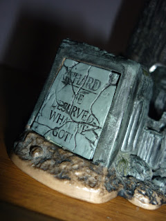
And how we know his name? At the side of the display base there is a plaque that reads "Richard He Deserved what he got!". A pretty nice detail that can be a little creppy at times, like why is he bing killed by a Werewolf over his own tomb? It was destiny or hes actually a ghost? I love how this playsets have this tiny details are allround.

The set consist on a path in a forest tough this is no pretty path with pasture and flowers arund, the soil is dry and muddy, there is no green in here eccept for a dry, dead and hollow tree on the side. The sculpt and painting of the base is gritty and matches perfectly the horror setting and the tree looks pretty natural too. The road is inclined soo is extremelly difficult to put Richard on it but the Werewolf looks spectacular on top of it.

The tree can be open and Richard can be hanged inside with the help of a hole on his back and a peg. Of course he fits inside once he lose his limbs. Open the secret door on the tree and there he is, hanging with his arms and head liying around, like some kind of butcher basement.

Is cool to think that the Werewolf is soo smart to store his food like this, i mean, he is part human, he must be smarter than your average wolf. The sight is pretty gruesome, tough as a kid i really loved it.

I really dont know if i like this playset more than Dracula. I hate Richard but everything else is pretty impresive tough i can say i like this design much more than the later version McFarlane released in 2002. And i like it more than the playsets that i am misisng on my collectiob, Frankenstein and Quasimodo (i never liked the Hunchback as part of the Monsters line up).

lunes, 9 de agosto de 2021

DRACULA


 While i meet McFarlane Toys at first with the Spawn figures and i loved Spawn when i was a kid, i wasnt very involved with the line too much. I actually have an alarming lack of Spawn toys on my possesion. My interest on the brand tough came with its line tittled McFarlane Monsters, the classic Universal Monsters action figures redesigned by the father of Spawn.

The twist tough, was that instead of average action figures, McFarlane designed playsets for each Monster. As a kid i was in heaven with this idea since it give me more to play with and while the figures were not that big, the scenarios compensated the size.

The figures are smaller than anything McFarlane did back then, they are the size of a Funko Pop actually and the very first was of course Dracula. The father of Spawn have a pretty unique take on designs since he tends to land too much on the overly grotesque and deformed, wich i think it suits Dracula nicelly since he designed the count with long hair and a hunched figure, pale skin and long fingers, pretty non-human and yet pretty elegant dressed in black with a scarf and a red cape.

The cape is made with thin cloth soo it helps give the figure a pretty nice look and since is attached to the wrists, it dosnt get in the way of the articulation. And he is articulated on the neck, shoulders and wrists only soo theres not a bunch of playability with Dracula himself tough he can stand on his own perfectly and the red scarf on his neck can be removed.

As the main piece of the set he is really nicelly sculpted with the wrinkles of his suit accentuating gravity and how thin is the count under the suit and since he is cast on black plastic, the paint is mostly for his hands cape and some other details (like the blood drops on his shirt) and looks really nice fot such a tiny scale.

The secondary figure of the set is the count on his vampire form. A pretty grotesque vampire bat creature that looks more like a tiny demon than anything, his wings are actually extremelly thin for a fliying creature and his entire body is mostly bones with skin. He is completelly black with some blue paint to high light his weak mosculature and white paint on his long nail fangs and red eyes. He is articulated on the neck and like his humanoid version, have ball joints on his shoulders.

The background consist on a cementery grating with a mausoleum at one side and Dracula´s coffin at the other. The sculpt is good and while its mustly cast on grey plastic, the cracks and other elements are painted accordinglly to not leave any element out; dirt, different textured bricks, a black rat on the wall.....also the black grating have cotton on top to emulate fog crossing the cementery. A pretty cute and cheap effect, dependeing of how you look at it.

The mausoleum have a golden plaque that reads "Vlad Dracula The Impaler" and a design of skulls and bat wings on the top as well as a revolving doors system to transform Dracula from bat to humanoid: hang the vampire thingy from his tail in front of the plaque, the door turns and reveals humanoid Dracula at the other side.

This is a nice little action feature but dosnt works at all since both Dracula and the vampire thingy are too big and get stuck at both sides.

The coffin have a wood texture and paint with a golden design on front with a demonic face or spirit of some sort and can be removed from the base with no problem. Lids open and this time Dracula can actually fit inside perfectly even with the lid closed.

There is also an axe that goes in the background and can be removed from the base. I have no idea of the propuse of this accesory since Dracula cant hold it, and there is also a big wooden stake that fit perfectly on the obnoxious big hole on Dracula´s chest to make him rest in peace forever.

I have to admit is extremelly cartoony, Dracula is a little bit over the top and the vampire version reminds me a lot Frigth Night vampire creature, but overall with the cementery, the coffin and the cute fake fog, the display is pretty classic, looks like a pretty traditional vision of a vampire perfect for any halloween decoration.

And as a kid i actually didnt had any problem with McFarlane vision of Dracula, i loved this set despite its defective action feature, tough the next set wasnt that exciting for me since it was Frankenstein and sported an smaller set up, soo its one of the missing pieces from my collection.