lunes, 31 de enero de 2022

DRACULA

 Last year there was a resurrection of the dead: for no aparent reason we had an influx of new merchadise of the Universal Monsters, something that didnt happend since 2010 (and this characters are not the only ones resurrected from the dead). Many companys started producing action figures of the Monters and one of them was Jada, a company that until now only created car models, never before an action figure.

Jada´s Frankenstein Monster was OK but i was really blown away by the Bride and the Gillman super high quality. The only one missing was Dracula, who didnt pick my interest at all but given the incrediblly low price this figures have (cheap as a brand new Funko Pop) i ended completing the collection with Dracula.

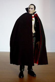
He is on a really good scale with the others, shorter than the Monster and the Ceature but taller than the Bride, tough he is still taller than your acerage Figma figures but not by much, this is a small scale collection. He can stand on his own perfectly and is articulated on the neck, shoulders, biceps, elbows, wrists, waist, legs, knes and ankles. He is entirelly made with hard plastic but given the simplicity of his design, he can total freedom of movement except on the shoulders, the shoulders are pretty difficult to move for some reason but this is the same with the other 3.

Like i said, the plastic he is cast on is pretty rigid and feels cheap, tough the sculpt is good, with nice proportions and his entire suit lacks any kind of texture, the culpt on his chest and face are the most intrincate. He is in a weird limbo tough...just like with the Monster, he have Bela Lugosi face features but looks more like a guy dressed as Lugosi but not real Lugosi. Is hard to nail the reason but of course i dont see the Lugosi Inc logo on the box, soo is obvious Jada didnt sign any contract with the Lugosi familly.

The paint is OK too, his skin is almost grey and his lips purple, looks nice for a living dead and his eyes are blue, tough the skin color is invading his hair and is not the only area the paint is sloppy since the red ribon on his chest is also stained with the whte of his shirt. His vest is perfect tough, specially with the buttons and thats it, pretty much the rest is solid black with ho shade or anything to give him any volume.

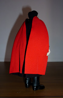
Now the cape, i am never a fan of real clothe costumes in such a small scale figures for this reason. The cape is made on a pretty nice and soft material, pretty thin, like the Bride dress tough is not accurate in color since they give it a red interior and Lugosi´s cape was grey, but is also made of 3 pieces with a thic embroid where the pirces join, givin the cape and off shape, it cannot rest on Dracula,s shoulders at all wich is pretty anoying.

The cape is put in place with a cuple of pins on Dracula´s back and while this is really cheap, since everything is black, the pins are almost invisible and they actually work good to keep the cape in place, tough there is a big black spring at the front, around his neck and looks really really cheap and tacky.

His acceosyrs are an extra pair of hands in claw shape, for attack mode, tough one detail (or lack of it) is that they dosnt have fingernails. The hands exchange is pretty easy and works good and there is also an extra head with a fierce expression and fangs out and they really overdid things here (not a surprise considering how easy si to overdo things in such a small scale). This extra head dosnt looks at all like Lugosi and it shares the sloopy paint job tough the fangs are the worst part. Yes, his mouth is pretty detailed even you can see his tongue, but the fangs are soo thick they looks like plastic fangs from a halloween party.

There is also a candelabra made with extremelly soft plastic that fits perfectly on his hand and have a cute dragon sculpted on it. The paint is really perfect here tough with gold and rubber tones and a nice white applyed to the candle. 

And lastlly there is also a vamprie bat with a nice sculpt and a total lack of paint. This little fellow have his feet shaped like rings soo he can stand on Dracula´s finger. Its really silly looking but i gues sis better than having the little guy liying in the ground.

Overall, from the four figures wave this Dracula is the weakest. Part of the reason is Dracula´s design of course since he is not specially exciting looking, but the poor materials and lazy paint also ruin a descent sculpt. Tough in the end he still looks good surrounded by the other Monsters and is a nice apeticer unti NECA release theyr Ultimate version.

domingo, 23 de enero de 2022

SWAMP THING


When Todd McFarlane created Image comics he did it shatter the chains DC and Marvel put on comic artists for many years, and when he opened McFarlane Toys he did it too to create figures on his own therms without the big corporations over him (Kenner, Mattel...), soo McFarlane was the rebel boy of the 90s, kind of like George Lucas or a Tim Burton. See McFarlane working for DC now is actually pretty shocking for me and i still dont get used to it.

In the last years, McFarlane has focused his entire existance to mass produce Batmen on each of his many version as well as other JL characters with irregular results: some figures looks pretty cool, some other looks hiddeous and horrific (Lobo?) but all of them stick to the "quantity over quality" philosophy. I knew i somehow was going to fall into that rabbit hole eventually tough wasnt sure wit"who" and now i know it: Swamp Thing.

I love Swamp Thing since i was a little kid, with the Kenner action figures, the silly movies and the Alan Moore comics, even this blog started with a figure of Swamp Thing and i am very happy McFarlane finally worked with the character, its odd he did it until now since the character fits perfectlly with Todd´s grotesque style pretty good.

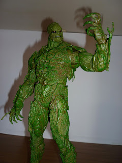
And this figure is actually gargantuan....GIGANTIC!!! Swamp Thing is twice as tall as the rest of action figures of the same brand of NECA. He is actually taller than a Hot Toys or a Play Arts Kai, reaching in high the Sideshow figures, making this guy one of the tallest figures i ever had. Tough he is quiet light and thats a good thing since helps him stand...kind of....sometimes. With his impresive size sometimes is not easy for him to keep balance.

Tough McFarlane gives him a base....a tiny black tokken thingy that fits with a peg on a hile of the figure feet. This small thing is totally useless of course and wins the prize of the most pathetic base i ever seen in this whle century.

Swamp Thing is articulated on the head, chest, shoulders, biceps, elbows, wrists, waist, legs, knes, ankles and halg feet, all this are ball joints soo they have a pretty wide range of motion but they also sre super strong ball joints that make a loud "click" when moved and they keep the possition despite Swamp Thing weigth. All of them except the half feet articulations, those ones keep beding and making him fall.

He is made with hard plastic, bbt have a cover of soft plastic moss and nature elements that cover the articulations perfectly. Like an example on his shoulders he have palm leafs that cover the ball joint completelly or his chest section that have some kind of "ribs" like structure covering the torso ball joint, pretty good aesthetic.

And this is where the figure shyne, since the Mattel figure that came out 10 years ago is covered in soft plastic, his articulations are very limited but this McFarane version have a total movement range and a sculpt to match that.

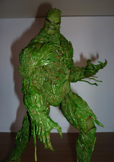
The sculpt is juts beautifull and impresive. This figure is totally asimetric, since on his shoulders have palm leafs, but on the other shoulder he have wood cover. Each inch of his body is is nicelly scupted to be different to the rest of the body and fill with amazing details, like roses growing around his spinal cord or some bony structures under the web of vines and moss. Even his joints are sculpted following the nature pattern, this when they dosnt looks like amall blank spaces with no texture.

My favorite part are his claws, he does have claws, pretty harp claws and his face, thick jaw with a fierce smirk and sunken deep eyes with pasture growing around it, it almost looks like a soft beard. The expression is really good, pretty stoic and strong, perfect for Alec Holland.

The paint tough, this is the element that ruins everything. He is green and thats it, just green....plain green with some brownish washes here and there but that all. The roses, the flowers, the roots, fungus, fruits and bones sculpted all around his body are just...all green. From a distance its ok he looks very green, but once you see the magnifiscent sculpt, its pretty evident how many elements are not painted at all.

The only detail on the paint are his mouth and eyes. He have pretty thin black lips and black shadows around his eyes that makes his bloody red eyes shine even more. The paint on his face is really good, but thats it....

He dosnt have any extra hands or heads or anything at all, aside of that pathetic and stupid base, he only have a kind of blade looking appendage that at first i tough was his penis. You can remove the hands and put this "blade" hand on the sucket of his arm. The process is kind of difficult but given how big he is i dont think it will be easy to break him. This blade thingy looks really good and is even articulated as wellm tough....its made of wood but is just all green....

Aside of that he also comes with a card. The photo on the card is pretty good looking and while is such an useless accesory, it feels a lot like something Playmates or Kenner would add if they made a DC serires of figures back in the 80s.

Despite the complete lack of accesoryes (i wish they gives him vines or rubber tentacles...) and the hottible and lazy paint job, this figures is extremelly imposing and menacing looking. By just standing in a plain museum straigth pose, this guy feels like a true dangerous monster. His silhouette and muscly frame is impresive and he towers over anything eles on display.

Its sad that McFarlane cannot reach the level fo perfection he had in the 2000s, not even with this amazing character and sculpt. This is soo clsoe to be the definitive Swamp Thing figure, it even tempts me to repaint him, tough this is deffinetly ine of the best monster and horro figures i ever seen.

viernes, 21 de enero de 2022

GOLIATH & DEMONA

 And i keep asking the same question over and over again: why? Why a series die completelly and 26 years later it start to appeare again at stores? When no kids even know the characters or the existance of that particular serires, when fans are old and probably have no means to buy new products, when that said serires is no on TV or even on streaming......and the last few years i been spending my money on the same stuff my parents did last century: Batman, Beetlejuice, Ghostbusters and Gargoyles.

 I never expect it but after Funko put his filthy hands on Gargoyles, NECA jump on the line as well and now even Quantum Mechanix. I dont have any of theyr products but i know they release very expsnive statues, plushies and mini figures like the Pop line of Funko, with witch much more higher production value.

And after a year or pre-order wait and an antire second year or delay thanks to the pandemic, here they are, the Q Fig Gargoyles and i must say, i actually forgot about them for the longer time but i am glad they are finally out. They released two figures that sold separatelly: Goliath and Demona.

While the box they came in is just BEAUTIFULL and pretty cool, this figures are quiet small, the same size a Funko Pop, half the size an average action figure soo they are just mini statues for decoration. Tough the siilaritys with Funko stop there since this figures goes the other direction completelly.

With absolutelly no articulation, Goliath is standing on the wall of castle Wyvern, roaring like he always do when the moon rise, wings open. The anatomy here is totally chibi since the head is huge tough the body have the rigth proportions leaving him on a half cartoony-half realistic style.

Tough Quantum Mechanix got pretty close to Greg Guller character design soo the odd proportions fit pretty nicelly, the sculpt have no textures beyond a soft like peach texture, just to give it a look of a 2D character and the lack of paint helps a lot too, since the entire figure is cast on purple , black and brown and the paint is limited only to the eyes, mouth, wings and belt.

Demona is the same size and have a more menacing and dynamic pose, with a knee on the ground and a brave look on her eyes, the paint on the eyes and mouth is extremelly simple tough, but considering the tiny size of this figure it looks perfect. I wish the sculpt on her hair was much more defined tough since the strands seems too soft.

But gladlly, all the pointy parts are ponty enough here! I mean, the claws, both characters tails, wings and toes. Also, unlike Goliath, Demona dosnt have any evident division on her sculpt and she looks seamless (i really hate the division between the arms of Goliath and his shoulders).

The bases tough have a crazy detail!! Both share the same wall frpm Wyvern castle and the paint really does makes it looks like solid rock! Its really impresive since bigger figures dosnt have this paint quality and the ground is the same, looks like the floor of a riverm with small stones coming out fo the ground and giving it a pretty nice texture.

Both are round bases with the logo of Gargoyles and Q Fig as well as the name of the character under it. The shape of the base helps a lot to save shelf space and of course, this figures will never fall either.

The small scale bugs me a little, i would love them to be much bigger like a real statue but i guess that would make theyr chibi style much more awkard looking, but just like this, they feelt like much more classy and high quality than any Funko Pop, even theyr box was pretty damn impresive. Now i am waiting for Lexington and Bronx and i wonder if we will get the entire Manhatan clan. 

domingo, 16 de enero de 2022

THAILOG


It hasnt been too long since NECA landed on Gargoyles territory with Goliath, a MASIVE and spectacular looking figure that leave me drooling for Demona next, but to my surprise, NECA had different plans and just released a totally different character in short advance: Thailog, the evil clone of Goliath developed by Dr. Anton Sevarious on Doubel Jeopardy, chapter 17 in season 2 (chater 30).

I am really glad NECA is also developing Villians aside of Demona, but honestly i wasnt specially excited for Thailog, as fun as he is on the serries, in reality he is mostly a repaint of Goliath, tough i see why NECA released him soo soon, since this guy was actually much more cheaper and easy to find than Goliath.

His box tough have a really pretty illustration, but side of that, Thailog is the same height as Goliath and have the same articulations: head, shoulders, elbows, wrists, abs, waist, legs, knes, ankles and half foot as well as tail and both wings, all ball joints with a great range of motion except on the shoulders, since they are very stiff but this is mostly due to his pecs and neck muscles being molded on hard plastic.

The tail is really bendy and is totally neecesary to make Thailong stand since his digitigrade legs wont lep him stand proerlly, specially with the wings. Those wings....they are HUGE and have a pretty strong articulation that clicks pretty loud when moved but they get on the way of his hair. His head, despite having a ball joint, dosnt move too much thanks to his hair, i really wish NECA had did the hair a separate piece with articulation.

The strong musculature and super detailed flesh texture on the wings are the same as Goliath soo they are pretty much perfect, the only difference between the two is the face expression, since Thailog is smiling, showing his fangs. I like a lot his expression, it gives him a lot of personality and along side the red eyes it looks incrediblly demonic and evil.

The other big difference is the color since this is mostly a repaint, He is dark blue almost black with some soft tones and brushes on the muscles to give it deep and shadows to that body and face features. His hair is silverish with some grey on the back but the best part is his bloody red eyes. The dark color palette with the red eyes and whire fangs and hair gives him a pretty cool and devilish look.

The other difference are his accesoryes. He have an extra pair of closed fist and an extra hand to hold his weapon. All works really good and can be exchanged pretty easy. Like i said he have a gun, a flare gun actually that fits perfectly on his extra hand. The gun looks pretty futurstic on a kind of retro style, like a weapon from the originalStar Treck.

His other accesory is a blast effect for the weapon. Remove the canister on the tip and put it on the blast effect, then attach the effect to the canon mouth and you have Thailog shooting the flare. The effect is GIGANTIC!!! Larger than Thailog with a fantastuc sculpt too!! With an explosion coming out from the mouth as well as smoke and a tail following the canister as well as another explosion on the back of the piece. The sculpt is really nice done, tough the paint is white with some orange and soft blue tones, the effect looks kinda cartoonish....is not realistic looking but deffinetly very stylish.

The other accesory is a black briefcase. The sculpt and black and silver paint on it is really clean and perfect, but once open, it reveals a lot of money and the keys of the chains Thailog use to trap Goliath, Xanatos, Elisa and Sevarius on the oil rig. Each pack of moeny is sculpted independently and the paint is perfecly clean, the attenton to details and quality of this accesory is astonishing.

NECA took the clone thing concept and stick with it perfectly since this figure share the same high notes and low notes Goliath have: He looks terrific on any display since no other company produce figures like this, he looks soo unique and beautifull.

And still, his wings are soo impractical, since they took a HUGE amount of space on the shelf and even pose him is a strugle with such big appendage on his back. The blocking on the head articulation and shoulders is not fun too and the shoting effect of the flare gun is soo heavy, Thailog have a lot of problems supporting it.

To be honest i wasnt very excited for this guy, he is really twisted and a sociopath and while NECA translated that very well to this figure, in the end is still a Goliath variant and i didnt expect him to be out soo early on the series it almost feel like Kenner releasing Goliath variants over and over again tough this is a nice snack while waiting for Demona.

jueves, 13 de enero de 2022

AXEL STONE


I love Streets of Rage and the last one that came out a year and a half ago is one of my favorite games in the last years, one of the very few examples of a game that actually delivers its full potential while keeping faithfull to its origins. And i love Storm Collectible figures, each one of them i bougth has been perfect soo when they release Axel Stone a year ago and i wasnt able to get him i was really dissapointed. 


Tough better later than ever, i was able to correct that and got Axel just before his price started to get too high and i am damn glad i got him. He is really stuning! Aside of the pretty box Storm Collectibles figures always have, this guy is on the same scale as the rest, being as tall as Terry and can stand on his own. He is articulated on the head, shoulders, biceps, elbows, wrist, chest, waist, legs, knes, ankles and half feet, every single articulation is a double joint or a ball joint, soo the movement range is absolute.


Also, since the shirt around his waist is made with soft plastic, it dosnt get on the way of his movement, tough the only issue i got is on his feet; the ankle ball joint is inserted on his shoe, soo while it can be moved backward a lot, it stops at the front of the feet pretty stronglly, soo Axel suffers the same issue Kazuya have: sometimes he fall backwards. Moving his legs can fix it and let him stand tall, but this is a small issue that gets in the way sometimes.


Soo, given Axel simplistic design, his range of movement is complete and perfect, he can take any pose you want and given he is a martial artist, he actually have a lot of pose options. I take way too many pictures of him and i had to delete a lot because they were too much for an antry on this blog. Really, the playability is endless on this guy.


The sculpt is brillant. Since he have such an anime look on the game, Storm decided to keep that look and mix it a little bit of realism as well, giving him a kind of statuesque look, his face feature are soo chiseled, and sharp, almost like a marble sculpture tough his eyes are soo full of life, soo big, shiny and livelly, this is deffinetly one of the most handsome figures i ever got.


His body struncture is really nice too, not as wide as he looks on the game (almost like a Capcom character) but he looks pretty athletic and spectacular on the chest area. Both his blue shirt and the one on his waist are made with soft plastic soo they have a pretty nice texture and i love the look on his snickers very detailed and very 90s looking.


The paint is as elegant as the sculpt, his skin tone is correct (unlike Haohmaru and Kazuya) and the paint on the beard dosnt mix with the skin at all, an impresive feat given the sculpt division is soo small. Like i said, his eyes are amazing, deep blue and looks weit and realistic. The rest of the figure keep the paint at minimum since all sections are cast in the dominant color, giving him a pretty vibrant and almost cell shading look that fits perfect on him. 


Tough something odd, his shirt paint is peeling off since the material is soft plastic, the paint cracks and peels off pretty easy. I dont understand why Storm painted the shirt tough, maybe the plastic color wasnt rigth?? The peeling off is mostly on the neck area for now, soo it gives him the look of an old shirt, but i am afraid it invades wider areas. The shirt on his waist dosnt suffer this issue tough.


Now the accespryes, this figure is trully heavy loaded, i think this is the Storm Collectibles figure with the most accesorys i ever seen, more than even Terry. He have four extra pair of hands aside of the closed fist: a pair to hold accesorys, an open palm pair, a two fingers pair and a claw shapped pair. All hands can be exchanged pretty easy and while they help a lot of give him personality, the most used pair will always be the closed fist.


He have two extra heads: one on a snarling expression and another one screaming, both can be exchanged with no issue. The sculpt and paint on this extra heads is as brillant as the basic head, with the wrinkles on top of his nose and each teeth sculpted and painted independently and a pin tongue in the screaming head, the level of detail is soo perfect.


He also have an extra hair piece. Yhea, i know is weird, just like Lobo. The hair section can be removed on all heads actually and this extra hair is a replica of all other hairs tough in a closer looks, its actually a little different....its moving to a side, like if Axel is jumping or throwing a punch, the hair moves with the motion. Its a little difficult to see the difference but is there and helps a lot for poses with heavy movement.


He have, not only one, but three different battle effects!! Lobo didnt had any effect and this guy have three different options! All of them flames cast in transparent plastic with orange, yellow and red tones. Two of them are a huge flame that moves on a half circle pattern, one smaller than the other one. The bigger one have some wild sculpt and spikes on the front tough this one is for the starting of Axel special move, while the smallest one is the end section of the special move animation.


Then the third flame have two tails that twist around Axel arm for an upper cut punch. All of them fits nicelly into Axels closed fist tough the twisting flame have some issues fitting on his arm. Despite of this, all of them are spectacular looking.


Then there is his weapons, because onlike Ryu, Jin, Demitri and other fighting game characters, Axel use pretty much any kind of junk he finds liying on the floor (actually, he is not even a fight game character at all!!) soo unlike the other Storm figures, he comes with A LOT of weapons.


He have a silver bomerang with a pretty cool looking design that only appeare at the beggining of the China Town stage. Also from that stage is the three spikes Sai, a weapon pretty natural for the ninjas, this item coud actually fit on any TMNT figure.


Then there two knifes, the normal basic knife and the butcher knife. Both have a very different handle, even painted in different color and while both looks brutal, the butcher knife reminds me a lot 80s toys, tough in the game it only appeare, again, at the China Town stage.


Then theres two bottles, one complete and another broken. Both are cast on dark green transluscent plastic and the complete one actually have bubbles inside, some kind of liquid. The broken one is the actually weapon and is perfect for any bar fight.


Then theres a sword, a katana with a beautifull blue handle. I dont remember exactly where this particular weapons appeare tough i am pretty sure is, again, in the China Town stage, on Shiva´s temple. Tough i have to say, this katana dosnt fit Axel at all, it feels too ligth and small for him.


The weapon that fits him perfectly is the baseball bat. Is huge and heavy and the orange paint on it is soo nice it actually looks like wood. Tough is a little bend, despite being cast on hard plastic. I dont know if this was an issue of this particular figure or if Storm made it intentional to give it the motion of movement.


And finall, he have a HUGE Naginata. This thing is actually divided into two and requieres assembly. Is the most brutal looking weapon, specially with the deep crimson tone of the staff tough i got the feeling is a little too big for Axel. Thsi is deffinetly the weapon i like less from his arsenal and, again, this belongs to China Town.


And while Lobo had absolutelly no background, Axel dosnt have one printed background BUTH TWO!!! This is the first time i see Storm printing two different illustrations in a single background and was such a nice surprise!! One shows the dark alley from the begining of the game, with the tattoo neon sign while the other shows a section a block later with a sex shop (???) and a much more colorfull palette. Both looks like they came from an animated cartoon from the 90s.


This figure was actually expensive, i give it a lot of tough getting him, but considering this is the only merchadise out there for Streets of Rage 4 convinced me, but also given how many weapons he have, the fantastic articulation system and how handsome and sexy looking Axel is, the quality is much more higher than the price.


Pretty much every single figure i got from Strom Collectibles touch perfection or gets pretty damn close, every single one of them impress me more than the last one. The only thing that could make this guy much better and fun is having a partner, i really hope Storm make a Blaze someday or any other character actually, Streets of Rage 4 deservs as many figures as Mortal Kombat. Too bad Storm dosnt belive it.