viernes, 25 de agosto de 2023

ISAAC CLARKE

 Why i like soo much Isaac Clarke? I never liked armored or mechanical looking characters, i even dont like Batman at all on the movies thanks to his robot looking outfit and a guy on an astronaut suit is the same for me, yet i somehow like a lot Isaac Clarke design, there is something cool on him, even if he looks soo bulky and slow moving, that i find really fascinating, specially on Dead Space 3 with the furry neck section.

Of course, maybe is because i love his game as well, one of the very first Playstation 3 games i played and probablly the most notable survival horror of its generation (with Resident Evil turning into the Rambo route and Silent Hill in total decadence) that manage to balance pefectly action with suspense, psychological horror with gore and a space age horror that i only seen on Alien. Dead Space is a game, even the thrid one with all its flaws is pretty much the best representation of At the Mountains of Madness.

Somehow tough there was a lot of merchadise of the games, something not even Silent Hill had back then and somehow, even more rare, i let it pass most of them and only got the ThreeZero 1/6 scale figure and the ArtFX statue from Kotobukiya, the subject of this entry!!

This guy is big...like, really big, the same size of a 1/6 scale figure from Sideshow or Hot Toys but considering the legs are flexing he is on a bigger scale and also he is really really heavy as well. Tough with the base included he can stand on his own perfectly with no problem.

Also despite being an statue this Isaac is articulated: the head and wrists and also his plasma cutter main section can rotate just like other versions of the plasma cutter. The weapon mid section and the hand that holds it have a cut joint that only rotates in one single direction, while the head and the freem wrists have ball joint and have a little bit more of freedom of movement.

The display options are limited but having them in this kind of product is rare. You can have Isaac looking at front, pointing his plasma cutter to his rigth or covering himself with the weapon from the left, the most anoying part is actually the plamsa cutter since it covers his face thanks to the position of the arm and while turning it around it also clashes with the monitor on his chest.

But once the plasma cutter is out of the way the view of Isaac is perfect. The sculpt is really really bautifull with all the intrincate detail on his suit perfectly represented, specially the furry neck piece. The protunding peices on his legs  like the jets and the knes wprotection are made of softplastic as well as the weird rails on his arms and the little jets on the shoulders while the rest of the body is made with high quality plastic, pretty dense plastic.

I love the different textures on each section, not only the furry neck but each part, like the knes section, is made on a different fabric and the protectors of the legs are full of scratches and other worn details. Even the green "cord" thingy that navigates around his legs and chest area is a real cord carefully enbroided with the plastic of the sculpt!!

The helmeth is perfect as well, again mixing cloth texture with metal and the only part that is missing any kind of detailing is the monitor machine on his chest. Theres no paint of sculpt there and thats odd given how crazy detailed is everyhting else, tough its imposible to see this section soo its OK i guess. Tough i still wish they articulated his shoulder soo he can move away the plasma cutter to see this monitor...

The paint job is amaxing! Very rich in diferent colors, greys, blacks, greens, browns, golden, metalic tones and other. Unlike the Three Zero version that have a brownish outfit, this one is grey with a dark wash on it that gives it a texture of a puffy materal. I think this is closer to the game design tough, i dont know why Three Zero went with the brownish look.

His mechanical boots have gret metalic with also cooper looking colors as well as golden tones, all with some dark washes to make them look dirty and very worn and the plasma cutter have the same color palette and worn feature, it looks pretty old and dated but that was Isaac main design concept.

Each bag on his belt have different tones of green and brown and his helmeth also have a big variety of tones of metal and golden. Its odd how this figure may looks just dark and simple but is actually pretty rich design wise!! Also the fur have a yellowish paint finish to  make it looks much more natural.

The only missing thing that the Three Zero version have is actual snow on top of his helmeth and outfit. I guess thats ask too much? But the snow base compensate that a little bit. The base is hollow and is the most ligth part of the piece with some simple blues to give a little bit of shadow to the snow.

Tough there is a corpse, or a piece of a corpse at least as wel where Isaac is standing. Theres a spinal cord and a littl of muscle structure with no shape at all with a dramatic spray of blood covering the snow in that section. Looks gruesome even if its imposible to know wath it is and helps a lot to condence the horror aspect of the series in a single figure.

Aside of the amazing sculpt and out of this world painting and high size, this figure have extra feature: led ligths. The top section of the waist can be removed to reveal a box for 3 batterys. Once they are in place and the top section reconected, with the push of a very discret button on his back the ligths turn on: the life bar on his back, the oxygen metter at the side, his gravity module on the palm of his hand and of course, his helmeth.

While the Three Zero use different ligths for each section (green, yellow and blue) this guy have only blue for everything and the ligth is actually pretty pretty strong since the actual ball joints are the bulbs. The effect is really spectacular and stands out even with all the ligths on and is easy to use.

I cant complaing in here about anything, this is a perfect representation of Isaac Clarke and maybe is better than the Three Zero one? I dont know...both have very different colros and the 1/6 scale one have a beautifully tailred suit and the different colors of the led ligths are oustanding but this Kotobukiya ArtsFX is really brillant as well.

There is a Figma and a Pop Up parade coming based on the remake but i doubt they reach this level of perfection.

miércoles, 23 de agosto de 2023

THE ORDER 1886 - THE ENDLESS DUEL

 By now is hard to belive there was a time where almost every game came with an Special or Collectors Edition packed with pretty cool items as well as high end figures just for $30 or $50 extra over the base game price. Rigth nos Special Editions are not that common and they cost the same as a PS5 console (and they comes with more digital content than physical items).....that was the golden age of Special Editions and those who lived them we manage to get a very impresive collection of big and really spectacular statues: Uncharted, Injustuce, Tomb Raider, Mortal Kombat, Batman, Aliens, Assassins Creed, Metal Gear Solid...

That era tough was still kicking in at the begining of the Playstation 4 life span soo we still got some really nice stuff, like The Order 1886 Deluxe Edition. The game itself was a kind of short affair that felt more like a movie with QTE than an actual game, very fun to look at thanks to very high production values but pretty forgettable to play with but Sony really belived on the project as the first exclusive for the Playstation 4 and give is not one, but two special editions: one was the Collectors Edition with a Grayson taking cover in some rubbles statue and the other one was the Deluxe Edition, more expensive and containing "The Endless Duel" statue.

The Endess Duel, a pretty fancy title for a figure that sound more like an art piece for a museum, but this figure is actually an art piece manufactured by Pure Arts, a brand that release very VERY expensive high end statues and 1/1 scale busts. I love theyr work and i never managed to afford one of theyr products except this figure and i am still surprised Sony commisioned them for an item of a Special Edition.

A battle scene between Grayson and a Lycan, this are two characters with a small piece of diorama that, going against al logic, stand itself pretty perfectly. The square base is really thuck and VERY heavy, soo despite Grayson being almost levitating at the side of everything, the base keep the whole scene in perfect balance and yes, a strong hit could detach Grayson from the base but soo far, after 8 years he his only connected leg to the base has resisted the time and keep him in position perfectly. This is testament of the high quality materials used here.

Where to start here? The whole scene is pretty good looking with Sir Galahad jumping backwards while aiming his weapon directly to the lycan, while the monster is launching himself agains Sir Galahad, read to cut him in half with his sharp claws while destroying a railing in the pricess as well as the floor with his weigth.

Theres no front side of back side here, every point of view reveals new details and every side you display shows an specuacular scene, being focused on Grayson or the Lycan attack. Is pretty rare to see a figure with no blind side tough, with soo many multiple display options and that needs an extremelly prices planing from the artists behind it. While the point of view wont be an issue to display this, the size will be....this statue is HUGE. The Lycan himself is the same size of a Hot Toys or Sideshow figure, plus his extended arm and the whole base and Grayson....this figure takes a whole lot of vertical and horizontal space.

The tiles of the base are perfectly sculpted, mixed with some broken tiles form the Lycan feet as well as wooden pieces  from the rail but the paint is also really perfect, with a pretty fot blue and white, the tiles but nly are full of scartches but they looks really really dirty with some yellows mixing with the white, they have an extremelly realistic floor look and the sides of the base is not just plastic either, but it have a cement texture in the four sides that flows perfectly with wath we see under the tiles.

The wodden rail is also perfectl, projecting the broken pieces with the power of the Lycan movement, not only the sculpt of the columns is really exquisite and the texture is realistic, but the paint in the broken sections also helps to make everything looks much more natural.

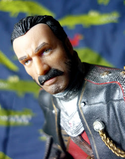
Sir Galahad is really handsome, with the material used for his skin having a soft transparency and texture that looks like real skin, while his mustache, sideburns and lips carefully painted as well as his yellow eyes. Theres not much of an expression on his face tough and thats weird given the intensity of the scene, but he is really good looking.

His uniform is also really good looking with the metalic chest plate having a tiny little red cross n the center. I emand, even the small buttons on his jacket are both sculpted and painted perfectly as well as the lions motif on his shoulders and other different ornaments on his complex outfit, most parts are sculpted on blue and brown plastic soo everything looks pretty clean and this lets each detail stand out nicelly.

His back side is really spectacular looking too with leather belts and straps and some red mottifs with golden ornaments but also theres a small dagger and a granade that can be detached from his belts. Sadlly, he cant exchange them for his main weapon, but is a nice detail to be able to detach this small weapons and see how perfect is theyr sculpt from every side as well as the paint.

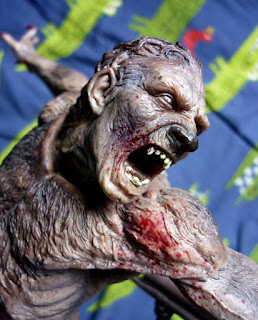
And for me, the Lycan is really the central star here and is really beautifully horrible and disturbing. The face expression full of fury with the protunding yellow fangs is amazing but even more amazing sre the little wrinkles that forms around the muscles of hus jaw, checkbones, forehead, nose and the texture of almost rott meat on bis skin, the veins under his almost rransparent skin, a mastefull mix of sculpt and paint, the looks of this creature is terrifiying natural and realistic.

The whole body matches the quality of his fac as well since you can see the muscle structure barelly covered by very tigth skin, with the veins sculpted on his arms and legs as well as the bony structure on his hips and center of the abdomen, revealing a canin physical structure mixed with human features. Theres some flap and soft skin here and there mixing with some hairy sections.

For a werewolf he is not that hairy but he matches perfectly the concept of one of this crature: a fusion between beats and human that is not one or the other but something totally inuque, a monster, an aberration. The cool and very sharp claws as well as the big animal feet are deffinetly my favorite part, but the whole image is acentuated by the spray f blood coming from his mouth, driping on his shoulder as well as covering his claws, a pretty intense and vibrant red that stand out agains his brownish skin.

Some brown sections may need a softer transition, but over all the whole production of the lycan is pretty amazing with soo many different colors here, some browns, some grey, even some purple in the articulations mix to create a pretty unique skin look that almost looks like a corpse.

Again, i am pretty impresed Sony added this figure to the game since, sold as a stand alone figure from Pure Arts site this figure would cost a fortune and theres no way to complaing, since every part of this figure matches a 3 numbers price perfectly.

This is one of the most spectacular examples of the golden age of videogames collectors edition and while no one remember this game anymore, this peice is excelent for any horro themed display thanks to the powerfull scene it shows as well as his trully menacing and firghtning this lupin monster is.

lunes, 21 de agosto de 2023

LARA CROFT

 Its hard to belive but its been five years already since the last game of Tomb Raider and theres no trailer or info about a new game yet and made me wonder if Lara Croft finally stoped being as relevant as she was in the 90s. Maybe modern gamers ask more now? Or maybe Lara´s new design made her lost wath made her speciall? Tough i hope the classic archeological adventure never stops being popular since its one of my favorites but its been quiet some time since Uncharted ended as well....

But in the peak of its popularity, Lara Croft gives us some really amazing figures and toys to play with, like the Playmates original statues or the NECA action figures. But the last trilogy of Lara´s adventure bring with them Special Editions that included great figures. The first game came with Lara´s Play Arts Kai while the second; Rise of the Tomb Raider, came with this statue.

Part of the Special Edition of said game, this statue is deffinetly not small. With base included she is twice a modern action figure and as tall as the GECCO statues and thanks to the big base that cant be removed, she stands saffely. Tough i have to say that huge circular base really take out an awfull lot of space.

Displaying Lara Croft at the middle of her adventure in the snowy montain, this image could be perfect for the (way to ugly )cover of the game. We got Lara stansing on the rocky terrain, very well equiped with her bow, arrows, a rope, a knife, a revolver, two ice axe and a flare, while the chill wind moves her hair.

The pose fits her perfectly and have enough movement and dynamism to not be boring. The jacket and pants have a pretty sublte fabric texture but not too much, and i find it odd that she have her neck soo exposed in such a cold enviroment. But the best detailed parts are deffinetly the smallest, like the boots, they looks pretty amazing,  as well as the gun and arrows on her back.

The flare is made with transluscent orange plastic and the bow´s string is a real string. This small bits make this figure looks and feel much more natural.

Lara´s hair have a pretty good flowing sculpt, with every string perfectly defined. But i am not very sure about her face....is not like she is ugly, but i cant see Lara face fatures here. I am not sure of its the lack of expression or texture on her skin, but she dosnt looks too much like Lara Croft for me. Maybe is the shape of her face tough, a little two round of the sculpt of the eyes.

Ot maybe is the paint. The soft pink lips are good looking but her eyes are a little too simple...and perhaps a little too high as well? They are painted above the sculpt of the eyes soo it looks like she have big bags under the eyes. The dirt and blood on her face is nicelly painted tough as well as her hair, with different tones of brown.

Her greet jacket and pants have almost no paint at all and looks really plain. Theres some broken bits on her pants but they forggot to paint them as well but the golden mottif on the bow and the colors on the feathers in the arrows are perfectly painted. They even add some orange paint on the pal of her hand soo it looks like the flare is reflecting light. Pretty impresive attention to detail here!!! But again, only on the smallest sections.

There is a soft cover of snow on her jacket and pants and this are pretty much the only elemenst that makes them looks detailed but there is also blood, dirty and more snow on her hands and other sections.

Maybe this is all thanks to the character design but Lara Croft was soo easy to identify in the 90s and 2000s, but in here, someone who never played Rise of the Tomb Raider would have problems recognizing who this is. Theres no color palette or any other clue that tie her to her old design and i am glad she is not as cartoony sexual as she used to look, but sometimes realism can make some really dull characters.

Its weird....i think this is a very cool looking figure that looks great on any shelf of a female explorer but at the same time i find it kind of dull or boring...this is not the most memorable design of Lara and her lack of expression or any kind of face feature makes her even more plain looking.

But as part of a pack is not bad at all and she have enough to be really good looking on any adventure collection under the rigth ligth and distance.

viernes, 4 de agosto de 2023

ANGELA

 It seems NECA is on a roll latelly, not only is close to finish the Universal Monsters line pretty soon, but it seems the Gargoyles line will be completelly out this year. I still remember the incrediblly difficult time i had to get Goliath and the looooong wait for Demona or Bronx. And still, outside of the United States it seems this figures still dont have a proper release thanks to Disney desire to....well, make life harder to anyone who lives outside of USA. 

But aside of Disney being an ass, NECA finally released a mostly ignored character from Gargoyles, Goliath and Demona´s daugther, Angela. This character was totally ignored by Kenner back in the 90s and i think she never appeared on any kind of merchadise back then. And honestly, i have a hard time thinking of Angela as part of the Manhatan Clan since she interatcs with them like...for only 5 chapters, the last ones of the entire series soo she didnt had enough time adjust to New York.

Angela is the same size as Demona, a little bit taller than Brooklyn and Broadway but unlike Demona, somehow her articulations seems stronger soo she can stand on her own perfectly, at least for now. She is articulated on the head, shoulders, biceps, elbows, wrists, chest, waist, legs, knes, ankles, half feet, tail and both wings.Elbows and knes have double articulation for a deeper bend (something Super 7 really needs) and the rest are ball joints, soo theres a lot of freedom of movement in here and that includes the bendy tail, that somehow is harder than Demona´s soo it holds Angela in place nicelly.

Everything is nice in the movement department except her head...the long, long, really long hair keep her head tilted down and even worst; the wings dosnt help and prevent her head to turn. Goliath, Hudson and Brooklyn have the same issue, but Angela´s hair is made with even much more harder plastic soo i am afraid to broke it if i push it against her own wings too much. Demona have suft hair tough...i wonder why not use the same material in here??

The wings have the share the same ratchet system of the rest of the figures, with a deep "click" sound each time they are moved and they are of course, really obtrusive and difficult to deal with, take too much space but i am used to them by now.

Theres is a lot of reuse in here, not as dramatic as with Thailog/Goliath but theres a lot of parts straigth from Demona. The legs, arms, wings and tail are all the same as Demona and thats not that bad given how similar to each other they are but i wish theyr wings were a little bit different. The torso and ehad are the only brand new parts and are prety nice looking.

Angela´s outfit hug her body nicelly and pretty natural and is made with soft plastic. It have a soft lather texture on it and looks much more frsh and new than Demona´s rags. Also her belt....i wonder waths the story of Angela´s belt buckle since is extremelly modern looking.

She is the character with the longest hair soo far and the individual strains are nicelly sculpted tough i wish they added some articulation into the golden rings holding the back of her hair, that would improve much more her head articulation. The face is soo soft looking....at first i didnt liked how she looked on pictures, but now in hand i like a lot the face sculpt.

She dosnt have the chiseled and elf like face features of her mother but instead Angela´s face is a little more rounder and her eyes are bigger, almost more "cartoon". She dosnt have the personality of her mother either....since Demona´s smile looks mischevios and inoccent but at the same time pretty evil and demonic, but Angela instead have just a pleasant smile with a kind of a empty look into her eyes.

She is cast on purple plastic wich gives her a pretty clean and cartoon look and since she dosnt have the musculature of her father, her skin have less shadows and less paint and somehow it gives me the impression of grape bubblegum. The big white eyes with darker shadow around them contrast pretty good with the purple skin color as well as the vibrant red lipstick, she really is pretty looking.

The black cord on the chest and sides area is perfectly plainted and her outfit have a creamy color that contrast with the other gargoyles old and very used rags, she almost looks like the cleanest one soo far. Her wings are black just like Goliath´s and have the same pearly and iridiscent blue tones on them. The rest of the body have the same quality paint the rest of the line have.

Also, she have real metal earrings just like Demona´s.

The tough part are the accesorys, this characters dont interact with a lot of stuff in the show soo just like Hudson and Bronx, she dosnt have too much to chose from. To start she comes with 3 pair of hands: closed fist, claw open hands and hands to hold the laser guns. Of course she dosnt have any guns to use but this extra hands are exact replicas of Demona,s hands soo...

Waths totally new is her face plate with a fierce expression and red glowing eyes. Her face is totally different to Demona´s in here, the shape of her mouth and chin. Also the shape of her eyes is different wich gives her a pretty individual face features despite sharinf the same expression. The fangs are extremelly good looking as well as the tongue inside with the red wet paint and of course, the red on her eyes make them looks like they are really glowing.

Then there is an egg. A giant purple egg with sculpted dots and sculpted and painted cracks all over it. The egg can stand perfectly and can be open from the center. And is enormous....way too big.....i mean this egg is twice Demona´s torso.....if she had this inside her and had to give it birth i totally understand why she hate Goliath and the rest of the world.

And then theres baby Angela as well. This baby gargoyle kind of fit inside of the egg but not when its closed. To my surprise she can stand on her own perfectly and is sculpted on the head, wings, tail, shoulders and legs, all ball joints soo theres a lot of posability wich is rare fory such a small figure with such short limbs.

The sculpt is good i guess, with pretty round claws and feet and everything is chubby in here. Angela´s eyes are HUGE and very anime like and her short hair is nicelly sculpted as well. Again, cast in purple plastic soo the only paint is on her pueple hair (why puple) huge eyes, purple lips and pink checks as well as the black and blue metalic color on her little wings.

Is in here were we can see NECA being creative. This little accesory is its own figure and have the same articulation and details as the rest of the figures, is really good looking but i dont remember seen this on the series at all. I think we see Angela as a baby on the Magus shoulders for like 2 seconds and half and thats it, Is nice but i cant see how adult Angela can interact with this.

I seen many people claiming the only want this figure for the baby. Is cute but i am not sure it fits on the display at all, specially with how irrelevant it is. I would have liked much much MUCH more a pair of closed/folded wings instead of this baby born with a loincloth.

I dont know wath to think about the baby but adult Angela sure is a great looking figure tough i honestly cant find her as half as interesting as Demona, but is good to finally have her on action figure form to join the rest. Now we are just missing Lexington....just one gargoyle to complete the collection and i just hope NECA dont lose momentum.