The begining of the century was a pretty interesting moment for toys, since thanks to McFarlane effort toys where no longer percived as products for kids and the route of adult collecting was opening for them. Many newborn companys took this path as a result we had a huge amount of figures based on horror movies, monsters or adult series and using great sculpture and painting and videogame figures were extremelly popular back then.
Resident Evil also participate in the change back at the end of the 90s with the Toy Biz series based on the first two games and not long after that, Moby Dick Toys produced some really magnifiscent pieces, but for a totally different market: Japan. Back in 2001 tough, one of the many newborn companys was Palisades Marketing, a brand that launched with The House of the Dead 2 figures that didnt sold too well, but theyr Resident Evil line was much more succesfull.
Unlike the Toy Biz series that focused on individual games (and that makes it fantastic), Palisades followed the Moby Dick route of mixing different characters of different games for a more global vision of Resident Evil. The series only had four figures tough: a human, two small monsters packed together and two big boss monsters packed individually. The very first figure laucnhed by Palisades was Leon S. Kennedy from Resident Evil 2. Leon was actually such an underdog back then we didnt expect to see him at all in Resident Evil, soo i pretty much ignored him.
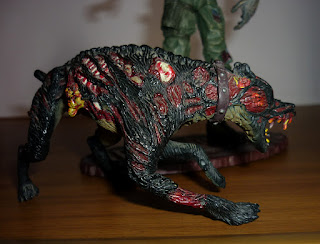
The second figure tough i coud not ignore it: a Zombie Soldier and a Cerberus dog from Resident Evil CODE: Veronica. Scale wise, this figures were bigger than the Toy Boz but smaller than the Moby Dick, soo thery were trapped in between the two series but they matched in size perfectly with modern NECA figures.
I never had problems making them stand tough the Zombie Soldier have a base. He is articulated on the neck, waist, shoulders, elbows, wrists, legs, knes and ankles, tough all this sections are cut joints articulations that only move in one direction, no ball joints at all. This was the standar back then and really limits the movement, specially on the elbows....
Tough this rigid style of movement help the Zombie look quiet a bit and is posible to give him some cool poses, but is also really frustrating. The sculpt is really good, the face is full of gruesome details like the shrieking face expression or the missing meat on his firehead or biceps, the aged skin and baggy uniform above his thin skeletal frame. His is missing a bot as well and is based on a CODE: Veronica artwork that came in the Dreamcast package.
The paint tough is not that good. There is a lot of different color washed on his green uniform that makes him looks dirty and the same goes for his skin, but somehow the blue and geen of his skin and uniform kind of mix and give him a look of a solid green piece of plastic. I wish they give him a little more brigther tones.
The reds of the raw meat with ni skin looks good as well as the green ooze on his mouth and silver eyes, but some details look pretty tacky, like the yellow on his hands or some of the bites on his arms. Paint quality wasnt too good overall, juts like with The House of the Dead 2 figures.
The Cerberus dog has no articulations and is possed on a runing motion, and like the Zombie Soldier, his sculpt have a comic book quality. The features are kind of exagerated since he dosnt looks too much like a doberman and looks more like a hard to identify beast from hell.
The color is really good tough, better than the Zombie paint since his furt is completelly black and that makes the red injuries to stand out a lot. Theres bones and ribs coming out from his skin and theres yello intestines hanginf from his stomach as well as his yellow eyes and fang. Is pretty gory, pretty frigthing and pretty classic for figures from the 2000´s.
There is accesorys: a pistol....the Zombie cant hold it of course soo the pistol fits on the holster on his leg and thats it. I dont know why give him such a weapon but tehre is also a base with a peg to stand him on it. The base is oval shaped with a wall of red bricks texture and the red logo of RESIDENT EVIL. Pretty urban and fitting for the series back then.
Overall, the articulations were not very good as well as the painting, but back in 2001 this was really fantastic figures that while not matched the lievel of quality of Moby Dick Toys, they deffinetly were seen as a big upgrade over the Toy Biz line and look great on any horror collection.


No hay comentarios.:
Publicar un comentario